Amber and I are doing our own separate Pinterest Challenge posts, so mine will post today and her’s will post tomorrow. They work together but are different projects (read too long for one post).
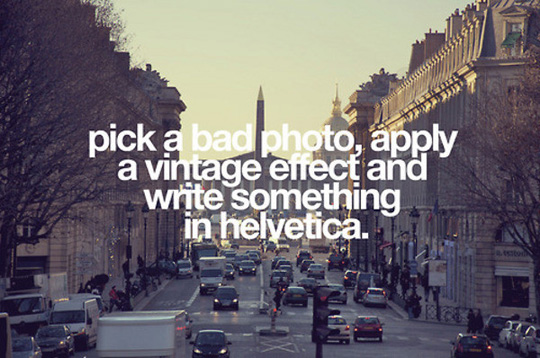
(source)
Above is my inspiration image. Yes, I understand that it is making fun of the genre, but when I saw it I had an idea. Basically I wanted to find a cheap vintage piece of art, so I could put a type treatment on top of it. Finding a vintage landscape-ish piece was on the top of my list when we went to the Nashville Flea last month.
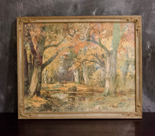
This is the piece we found. Amber wasn’t sold on it, but she knew I had a plan which never happens when we antique shop. (Side Note: Amber wasn’t the only person not feeling it. When we were showing our scores at the flea to some of Amber’s family members in TN, the only nice thing they had to say about this one was “Well, it’s got a nice frame.”)
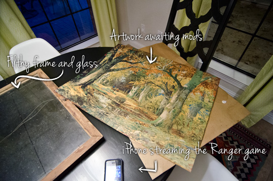
The first thing I did was remove the artwork from the frame.
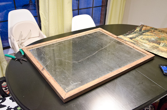
Boy howdy, was that bad boy filthy. A little windex and some elbow grease and the glass looked good as new.
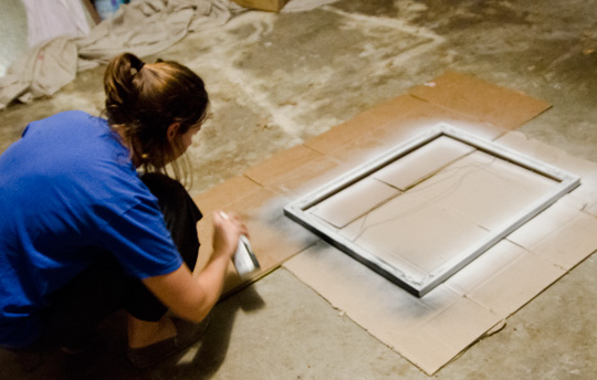
With the glass and artwork separated, Amber took the frame to the garage to update it with a bit of flat black spray paint after she primed it of course.
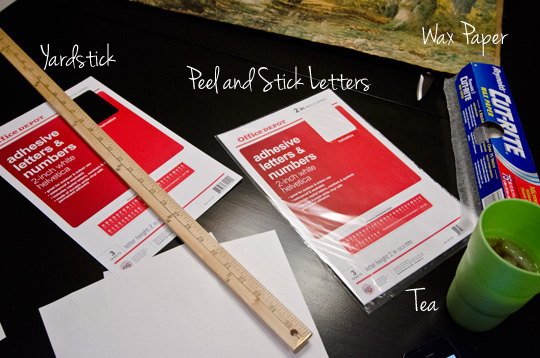
Here are the supplies I started off with to layout the type:
- 2 in. white helvetica letters from office depot. I bought 2 packets for about $5 each.
- Wax paper
- Yard Stick
- Iced Tea (optional)
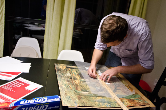
Originally, I thought I would use the yard stick and lay them out by hand. This proved to be really difficult and looked bad. Unhappy with the results I regrouped a bit.

After a text message conversation with Mrs Weydeck (Her husband and Amber were in the group text as well, no funny business happening at Wills Casa), an expert seemingly at all things craft, I decided to lay the type out in Photoshop, print it out, and use it as my guide.

Using the printed text under the wax paper proved to be much easier, exact and faster. A real win-win-win situation we had working there. You probably can’t tell from the photo, but I misspelled the word is (added an extra ‘s’) in the first run…. yea, hurts to miss that one.

After the type was done, we put painters tape across the top to pull the letters off the wax paper. I used Frog Tape because it’s what we had laying around, though I would recommend using a tape made for delicate surfaces if you can.
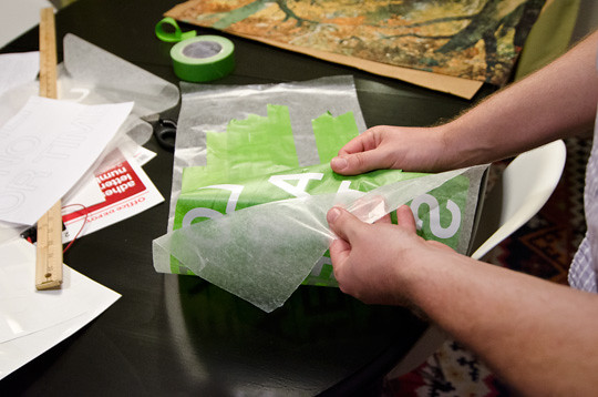
Next I peeled the letters off the wax paper. Lots of gratuitous peeling action happening in this photo.

Here’s what the type looks like peeled off and ready to stick on the artwork.
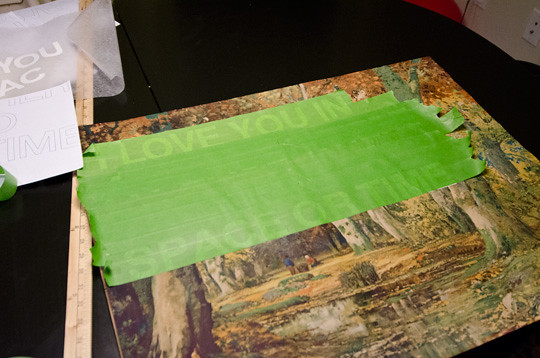
Then we placed the type on the artwork and peeled the frog tape. Here’s the part where more delicate painter’s tape would have helped. Some of the print peeled up with the tape (you can’t really tell in fact it gives a little charming noise).
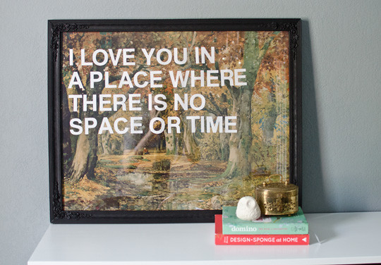
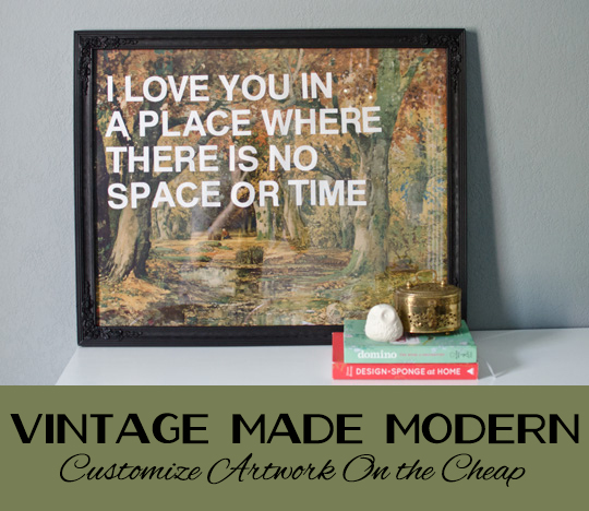
After letting the frame dry over night, we reframed the artwork and BOOM! The piece was done.
The total project cost us about $25, not too bad eh?
If you’re wondering where the quote is from, it’s a line from an old Leon Russell song seen in the video above. I actually got the idea from a vintage rolex that I saw on eBay (but appears to have sold). The quote is the main reason why I wanted it to be a landscape. I thought the quote needed to be on top of a Place.
So what do you guys think of the artwork? Any of you guys doing the Pinterest Challenge as well? We’d love to hear from you!
See this guy in our gallery wall here.
Check out what Sherry, Kate, Katie, and Michelle did for their pinterest challenge!


I love it! I may have to steal the idea and use my Silhouette machine and vinyl that Mike got me. I am wanting to cover one of my walls in my classroom with pictures and quotes like that.
It would be easier with a Silhouette machine, but still pretty easy. Your kids next year should feel special with all the classroom craftiness/art you’ve got going on! Think about how much they will learn to read from your art!!
What a cute project!
Thanks! It’s a quick way to get some custom art!
love. So fun that we shared similar projects for the pinterest challenge! And I totally agree, the yard stick method is rough – mine is definitely not perfect and a little off in spots, but hey, the imperfect look is in, right? Thanks for stopping by my blog and sharing!
Haha, imperfect is totally in! Your map turned out great!
Ours isn’t perfect either. Nick says it gives it a handmade quality. It’s all part of the charm, and you’re right the imperfect look is totally in right now! Thanks for checking out the blog!
Wow! I’m super impressed.
Of course, putting a little Helvetica on it always makes things look good, but I had my doubts when I saw just the photo above, but after you added the letters it looks great.
I’ve gotta pin this on myself! Great job!
Haha yeah I was not really feeling it either. I loved the saying enough to let Nick buy it anyway. I am glad he did, because it turned out much better than I expected. Thanks for stopping by!
It’s called vision ladies
Ha! You better watch it I know where you sleep.
Wow, I love that you took something that was completely ugly and turned into something really nice!
Haha thanks! Now if that can be the theme of our whole house we will be happy! Your teepee turned out great! Thanks for coming by again! Hope you haven’t let Max in on that little high maintenance secret about Ramona yet! 😉
What a great idea for placing sticky letters! Definitely will have to remember that one. Love how the sign turned out! I made a sign for the challenge, too, although it’s a different kind of vintage. Enjoy yours!
Thanks Erin! Your bathroom turned out great! I love the sign you added!
This looks great!! Helvetica makes anything look better! I’m definitely going to pin this for future reference!
Thanks Ashley! I am now a believer in the power of helvetica! Make sure to let us know if you ever decide to helvetica some art! We would love to see it!
This is awesome! Love how it came out.
Thanks! It turned out way better than I expected, and I really love it in the gallery wall too. Mainly I am just glad it’s on the wall not in a corner somewhere.
oooh amber i love this!!! yeah, i have no fear.. i just paint right over that sucker. 😉
Haha yes you are much braver than we are! We might bust out the paint on a picture soon though…
I just discovered your website via design sponge and adore it! I love this idea and may copy it too!
Thank you! It’s such a simple way to make some awesome art! Good luck!