
With all the craziness of packing, I felt like it would be pretty pointless for me to create a display only to dismantle it in a few hours. However I still want to achieve my monthly challenge, so I’ve rounded up a few displays that I was inspired by and am taking notes on for the next casa. Also make sure to check out what Katja has done to display this month!
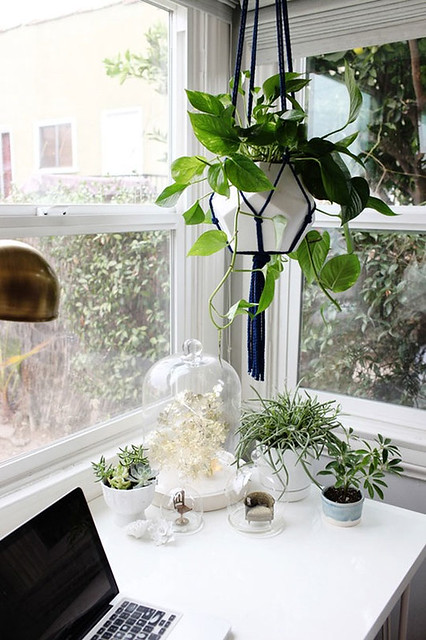
First up master stylist Emily Henderson. I love this display in the corner of her office. Next house needs to have a corner full of windows, so we can pull this off. I love the hanging plant (note the trendy faceted planter). The tiny chairs under domes is a great quirk to a corner full of greenery. There’s a lot of small pieces in this vignette, but it’s still so simple and completely beautiful.
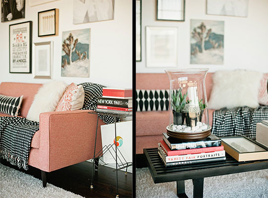
I had to get both angles of this space. The couch has a similar shape to ours, but I love how the textiles almost neutralize the pink. It makes you think yeah I can rock a pink sofa. I’m falling in love with black and white throws, pillows, etc. They are so graphic but without being loud. The mixed patterns and textiles on the couch look so effortless. The grouped succulents look amazing in that hurricane as well.
I want every piece of furniture in this picture. The rustic wood with the industrial metal then throw in an overall vintage feel…sold. Antlers and gallery walls are nothing new to home decor, but don’t they make them look so original here? Just deliver it all to the new house, craft room/office please.
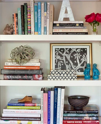
Shelf styling that makes me realize I should purge my books and start collecting pretty ones. Of course the layering and arrangement of the books is key, but look at that tiny shoe and air plant. There’s a lot of sculptural elements layered in with those hard back beauties. A picture to remind me that every space could use a little black and white.
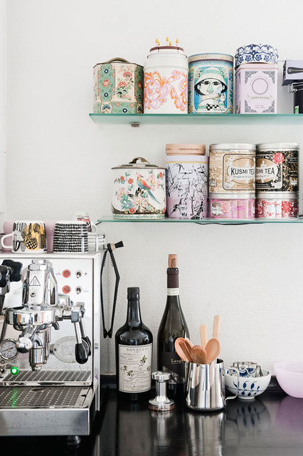
This vignette needs to be achieved in the next house. The only change is it needs to be all coffee related – no tea. Nick and I have been bouncing the idea of creating a more beautiful space for him to nerd out over his coffee. It will happen in the next house (I bet you saw that statement coming). If we could create a small space that feels like this dedicated to coffee, I would be one happy mama. Also when I can drink coffee again, I will be even happier. I spy a sweet little black and white mug.
Some display inspiration before you start your weekend. Anyone determined to go buy black and white now?
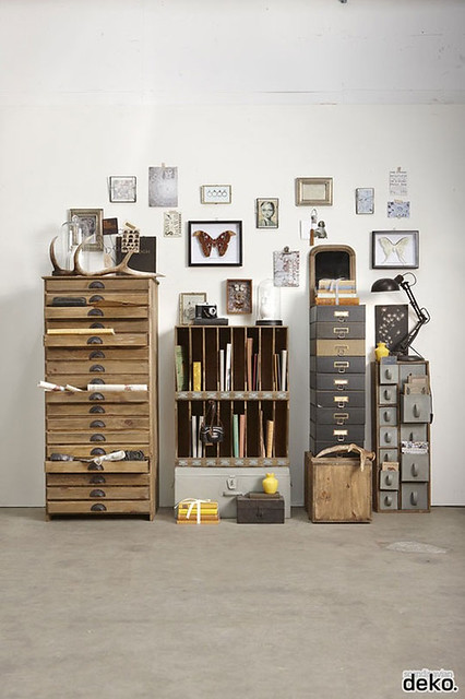


I love love love everything about that display with the wood and metal cabinets. Such great inspiration.
I know! I think it’s a catalog photo, but what a great display. I want to own a store and put that in my office corner. I would look like the most hipster store owner ever.
Oooo I love those displays. That office corner of Emily’s has been on my mind as well. I love how she does macrame. All the displays are so beautiful. I LOVE that one with the architect’s drawers in it too. Love that whole display and I can totally see why you just want, no need, that whole display delivered to your new place
I love everything Emily does. If only I could have a storage until full of all her vintage finds to decorate my house.