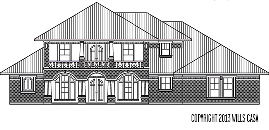
We focused on the floor plan layout first, because we knew we wanted a boxy house like this one above. Of course we sent over this example, so the architect could start thinking about how the layout would work with our desired elevation before he drew up the floor plans. I figured the clean boxy lines would be easy to achieve.
Our first elevation draft looked like this. I was like WHAT?!?! It looked more ranch style that is trying to be Mediterranean but got confused. It’s not ugly. It just wasn’t what we were thinking/expecting. We didn’t like the multiple peeks on the roof which can look great on certain elevations, but again not what we wanted. Our next step was to ask for the redraw to have the roof squared off. We needed the upstairs framed to match the downstairs to get that boxy look. Also we wanted the windows to be symmetrical to add balance.
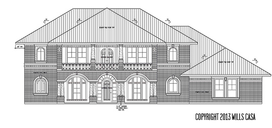
Oh so much better in all it’s boxiness. Now all that attic space in the upstairs floor plan makes more sense right? We have a covered front porch and balcony. The pillars for the balcony are pre cast columns.
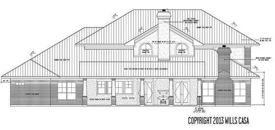
This is the back elevation. There aren’t many windows on the upstairs because most of the rooms are at the front of the house since only 840 square feet of the upstairs is actual living space.
It is pretty crazy to see it finished on paper, but we are really curious to see how looks once it’s up. We chose painted brick because it’s cheaper than stucco. However, we will have stucco sprayed on the back patio area (for the same reason why people have wood siding). People in Texas seem to prefer brick and stone exteriors anyway, so I think it will work to our advantage in the future. The roof is drawn to be a tile roof in typical Mediterranean style.
What do you think? Does it look anything like you picture?


Love it! Can’t wait to see what it looks like when its built!
We can’t either. It’s going to be so weird to see it up!
Beautiful! How exciting!
Thanks! We are really excited!
Well, you have me convinced that I need to build a house now, you know. Is this process fun, or does it just feel like lots of work? I love the style you’re going for–very cool look, and unique without looking out of place for your location. I’m excited to see it come along!
Do it! It’s fun but a ton of work (and we really haven’t started yet). It would probably be more fun if we didn’t have to think about budget. There is some aspect of a challenge with a budget that’s exciting too. Of course the most exciting thing is just getting it finished and having our own space again!
BOXY! I love it! I love boxy so hard. You did good
Maybe you and Boxy should get a room, amirite?
Dude. This is going to be one heck of a house. I’m impressed already! Are you all secret billionaires? Don’t lie to me.
I invented velcro. You can’t prove that I didn’t.
I love the design you picked as an inspiration, but I was surprised a little at the same time because you had leaned towards more mid-century modern, so I was expecting different windows But I totally love it and I think you made some really smart alterations in the roof lines. I really like that you are going for a more symmetrical look. Symmetrical=Fung Shui approved 😉 (I know you were wondering…)
I think we love so many different looks – colonial, modern, Mediterranean, Spanish – we just picked something with clean lines (modern) and added Spanish Mediterranean influence with a hint of colonial. Modern doesn’t sell well out here though, so making that decision was easy. I have just loved the arched windows in the homes Emily Henderson has been designing lately. I want some in my house. I’m so glad I’m still on the fungi shui approved list! I am definitely relying on you to steer me in that direction!
It’s beautiful! I prefer boxy houses too. Can’t wait to see how it looks once its built!
Thanks! We can’t wait either!