Happy New Year everyone! 2013 was crazy. I’ll spare you a roundup since I know you’d rather see me get in real time with the house. It won’t happen. I’m too far behind, but it is 2014 and we are still building. So there’s that. (Remember that time we built a house and thought it would be done in September or at the absolute very latest Christmas…we were so silly.)
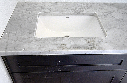
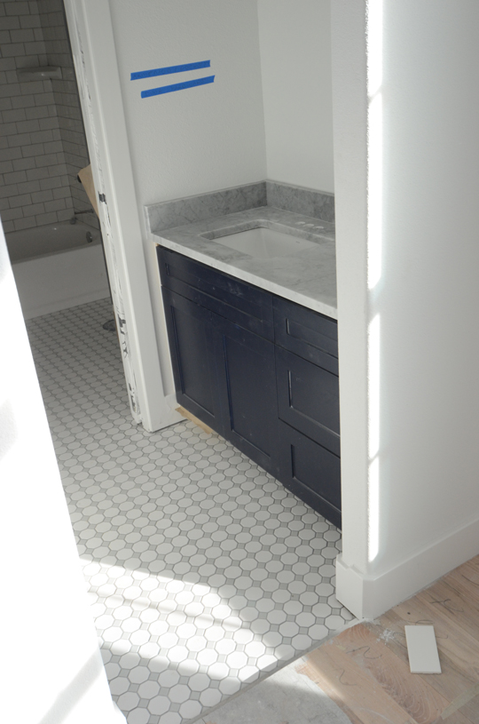
Let’s focus on the Jack and Jill bath for the kids shall we. We had already picked out tile when the whole countertop drama happened, but the countertops were installed before the tile hence the blogging order of such things. To bring you up to speed the last update was our navy flat panel cabinets with our (very gray) carrara marble countertop as seen above.
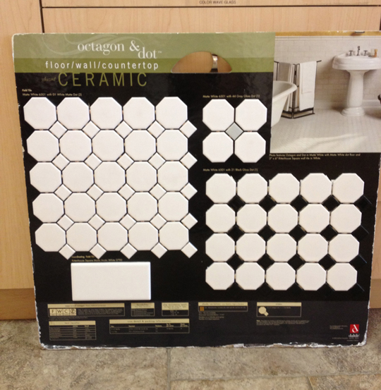
It is a little weird how quickly we made tile decisions. There are millions of tile options out there, but we knew the octagon and dot tile would give us the look/feel we wanted for this bathroom. We only had to decide on a color – white/white, white/gray, or white/black. I ruled out white on white immediately. I didn’t want an all white floor. I felt like the black or gray would break the floor up enough to avoid all the cleaning issues people have with white floors.
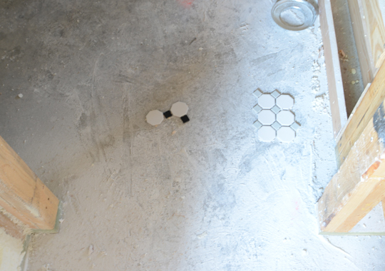
We have tried to focus on getting that older look within the house. Stick to the oldie-but-goodie mantra. The octagon and dot is pretty textbook classic tile. Plus the kids bath is pretty narrow, so using smaller tile in there makes sense. The white/black had too much contrast for that area. It was also a little too 1950s for what we were going for. White/gray combination was the winner. Subtle but enough contrast to give an interesting pattern that wouldn’t be too overwhelming for the space.

Here’s Ramona’s vanity. The counter is slightly grayer than the tile which I am happy about. I still don’t love the countertops, but I think they look pretty lovely with this tile and the navy cabinets. It’s only uphill from here. (Hardware squeal!)
*Sorry I didn’t take the plastic tarp off before this picture. I always feel awkward taking pictures while people are up there working, so I try not to touch/rearrange anything.
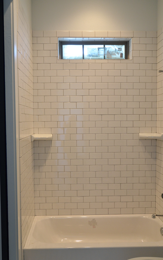
We did subway tile for the shower area. Shocker. We went with natural grout instead of white like we did for the kitchen. Mainly because I didn’t want white grout on the floor tile, so I figure natural gray was the best choice for the floor and shower. Simple and clean.
You can see all the pieces in play from Beckett’s room – the tile, cabinets, countertops, pocket doors, arched entry (imagine that at the top), and a peek at the shower. I’m thrilled with how the kids bath came together. It feels modern but has a lot of character.
Anyone ever cleaned these floors? Is it going to be a short honeymoon period before I want to rip them out? But seriously who cares about cleaning pains when the bathroom looks this good!?!


I love the look!!!
Thanks we do too! I’m waiting on the hardware to come in and that makes me even more excited!
it is looking so lovely!!! eek!
Thanks! Hopefully the kids will like it too. I have to figure out a stool situation since they will both need one for their sink area.
love it with the gray dot!!
So classic and beautiful! We couldn’t be happier with that choice!
Loving the bitty baby tiles and the natural colored grout. I know you have to do the slow reveal but I am really impatient and might have to sneak in a three hour drive this weekend:) The curiosity is about to kill me Willscasa!
Make the drive!! I might even consider not blogging the rest of the process until you come up here! Don’t tempt me!
P.S. you may get déjà vu if I do this for our girls bathroom…hehe!
I might but it would be the best kind of deja vu one could ask for!
So pretty. I love your tile choices. LOVE the dark blue vanity. Swoon. Love the subway tile too!!
Thanks Katja! It’s turning out to be a pretty bathroom for those grubby little ones to use! 😉
Oh I love it and I think I will be ready to move in 😉 Love everything you guys pick!
Offer accepted Julia. Pack your bags.
What color white for trim and walls in Baby Beckett’s bathroom photo? It’s a very pretty white.
It’s Sherwin Williams Pure White for both the wall and the trim. It is the perfect tone of white! We couldn’t be happier with the color.
Love the tiles. They’re classic and the grey tones go so well with the blue of the vanity.
They are classic, which is what we are going for. The crazy thing is how common they are in the rest of the country yet almost not existent here in Texas.
I’m obsessed with the floor tile. It’s my dream tile. I just want to roll on that floor a good long while. #i’mnotreallythatweird #yesIam
You are welcome to come roll on our floor anytime. #weareweirdtoo
I love your bathroom! I found your blog by “searching” for this tile. We just ordered it for our master bathroom and I was researching grout colors. I absolutely love what you chose–so much better than white grout as it really “define’s” the shapes. I see that you said it it “natural gray” and I was wondering if you know the brand? I’ve searched and I see that there is quite a variation and different brands that have that color. So happy to have found your blog–I can SO relate to so many of your stories
Glad you found us too Kelli! I don’t know what brand they used since the builder’s subcontractors did the install. When you get the tile in, just take a sample to compare with the grout samples. I don’t think there’s a wrong choice of gray with the tile! It’s forgiving with the white tile. It’s going to look great in your bathroom!
Very nice looking bathroom. Now that you have lived with it for awhile, how do you feel about the floors? Do they seem at all slippery? Do you find they need a lot of cleaning? I am on the fence about doing the “white out” bathroom and the grey octagon is in my mind as an option.
They aren’t slippery. I was a little nervous about the white, but the gray octagon and the darker grout really mask the problems people have with white floors. We would absolutely put these down again.
Hi! Just checking in to make sure you still love these floors! We are looking at the Octagon and Dot tile for our girls’ bath. The flooring showroom is recommending the white on white with the grout. SO MUCH WHITE! I’m sure it would look beautiful, but I don’t think I can handle the almost guaranteed dirtiness, so I’m considering the gray dot for an option. After seeing your blog, it looks like I may go that way with a light gray grout. Is it still looking good a year later?
Yes! I still love those floors. My shower tile has white grout and it’s a pain. Go with gray grout. You’ll be happier with that choice! I think the gray dot hides some of the dirtiness of the floor that the all white option wouldn’t.
Love the look! we are renovating a bathroom and found your blog. Would you mind sharing the color of the cabinets?
Thanks!
Kellie
It’s Benjamin Moore Old Navy like our island. You can read about other navy paint options we considered in this post.