We are moving this bathroom party upstairs for a sneak peek into our modern bathroom for guests and such. We were in a complete rush to make all the decisions upstairs. We didn’t go into panic mode or anything. The decision making process for the upstairs on our end was pretty painless.
We loved the tile choices for the kids bathroom. Plus we had some left over, so it seemed like the smartest (most budget friendly) move. We needed more tile but still an overall savings. The thing was we wanted this space to be unique since it will function mainly as the guest bathroom although anyone upstairs (the kids in their playroom and I in my office) will use it as well. We had to figure out how we could create a bathroom using the same materials but still be different from the downstairs one.
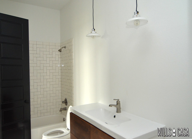
We decided to have them install the shower subway tile in a herringbone pattern. I got the idea after seeing Jordan Ferney‘s picture on instagram. Shocker I got inspiration from a restaurant (master shower floors were from a coffee shop, so totally fitting).
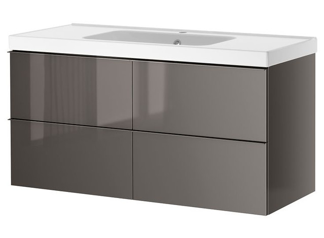
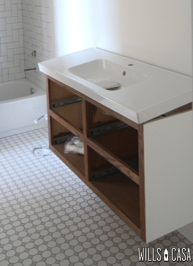
Initially we thought we’d pick up a GODMORGON IKEA cabinet. Gray seemed like the best choice since there is so much white in there already. I love the modern look, and a floating vanity would be a perfect step away from all the other bathrooms in the house. When we started comparing prices between IKEA and what our cabinet guy could make, it was tens of dollars. Yep $10’s. It was a no brainer.
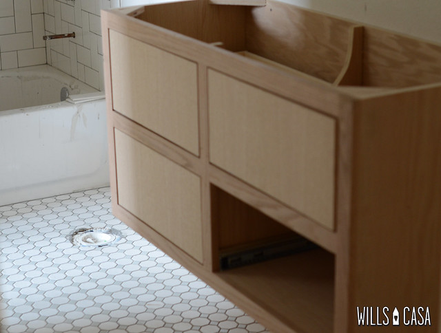
Except that it was a struggle for them to get it right. Face palm. I sent a very detailed email with pictures included (pro tips here). I wanted the cabinet exactly like the GODMORGON except all real wood with a painted shell and Alder wood drawers (yes I specified the wood I wanted for the drawers in the email).
First attempt the drawers are not full overlay like the IKEA version. Also the drawers were oak. (Fun fact 2nd attempt included oak drawers again!)
We did buy an ODENSVIK sink because $140 for a sink + not having to deal with the countertop people again was so worth it. We had it onsite before they built the cabinet AND we had the dimensions to the cabinet maker before he began. Amazingly that happened, so try again guys.
There were more fixes that had to be made to the drawers. They were too deep for the plumbing, etc. Fourth time is the charm apparently.
The ODENSVIK sink was a great call. A huge money saver, and it looks so good. We picked up the pendants from west elm. In person they are more of a milky transparent white than the picture. They are really beautiful.
The faucet is from Lowes. It’s the only bathroom that has nickel fixtures, but it works with the style of this bathroom.
You may or may not have noticed we don’t have a mirror up here. We are still deciding exactly what we want to do. We might DIY something or buy something. Who knows. We like to keep ourselves guessing.
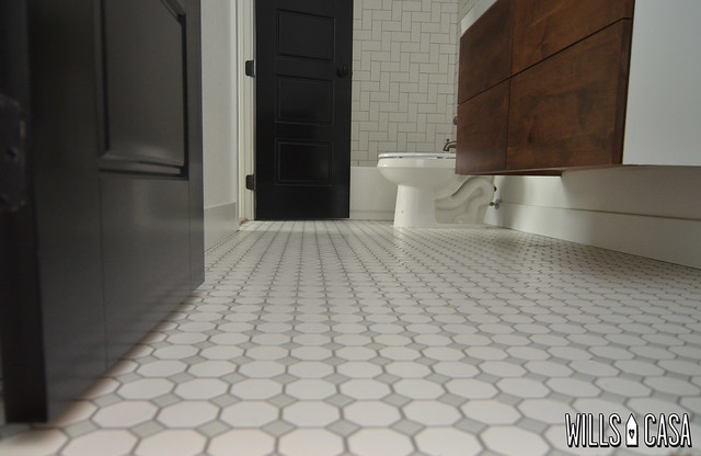
This is the view of the bathroom from the eyes of Beckett. I’m loving everything that’s happening in here. I’m not sure if I want to get a new shower curtain or use the Kate Spade one from the last place.
Guest bathroom is ready! Actually this is where we shower since the whole master shower isn’t functioning. A huge thank you to Nicole for putting the master bathroom on her honor roll.
Full disclosure you might think I’m annoyed by all the kinks and hiccups we had during the build and now, but it’s one of those things you just have to laugh at. In the grand scheme of things, it’s no big deal. It’s just what happens you have a specific idea of how things should be, and you don’t compromise that vision.
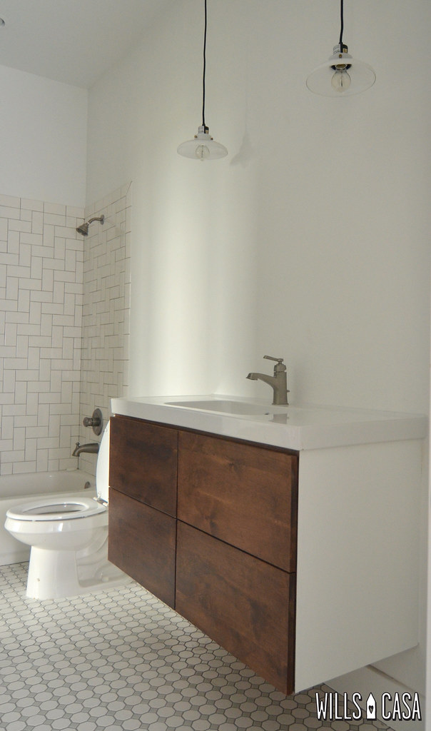
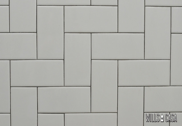


Liking the play of patterns with the different tile, and that sink is awesome. And yes, just laugh now about all the trouble you had to go through… it’s better than crying. Serenity now!
Haha so true! There is a nice pattern play happening in there! I love the floor tile so much I don’t want to put a rug down!
Love the tile pattern. What color grout did you use? Is it a full black or is it a charcoal grey? Looks so fresh and clean!
It’s natural gray. We used the same one in the kids bath too. I didn’t want white for the floor grout, so it made the most sense to do gray on both. Plus the pattern is more noticeable this way!
so pretty! that tile pattern is genius!
It really is. Thank you The Mill in San Francisco!
I love that herringbone pattern. Is that, what, turned 45 degrees? That is so smart. I love the freshness of that. That floor is awesome too and I love the vanity. What a pretty wood for the vanity. Totally in love.
I think it’s 90 degrees, but I’m not real good at math. 😉 I’m so glad we could talk this bathroom through on the phone when it was happening. Also great to have your advice!
Love every single detail in your bathroom. The regular Wills’ eye candy 😉
Haha the only thing missing is Nick holding up a mirror. #throwbackthursday
Love it! The fun tile plus the great vanity/sink are perfect. The lights are a bit unexpected in a bathroom so really cool. Can’t wait to see what you do with the mirror. We searched for a mirror for our powder room for a full year. Then we settled on something pretty mediocre and now I’m itching to find the right mirror. It’s hard work to find all of the little details, isn’t it?
Details are so killer, and mirrors are super difficult. They are a necessary evil! My guess is it will stay mirror less for a long time. Maybe until your clan comes and stays!
oh i love it! the classic herringbone…. or is it? 😉 but seriously it’s awesome and so glad you are getting ready for my visit.
Classic with a 90 degree angle…or that’s my story anyway. We are all over your visit. Full preparations are being made.
Love floating vanities. Love, love, love. I just think they look especially great in smaller bathrooms and give them a sense of airiness that is normally reserved for much larger spaces like the master bathroom. Will you add any hardware to the front stained drawers?
I want to add some hardware to the top of the drawer like the IKEA one as well. I haven’t even started that search. Thanks for the reminder!! The bathroom is so skinny the floating vanity really opens it up.
I lovve the vanity. If it makes you feel better, I’m obsessed with that ikea vanity and instantly thought of it when I clicked over. We wanted it for our bathrooms before we decided to leave sooner and just painted them [boring]. So pretty. Maybe a circular mirror?!
The vanity is really great. I love the high gloss finish on it as well. Oh IKEA such great design. I was wanting a skinny rectangular one, but the right dimensions are hard to find. Makes me thing we will have to DIY something.
Love the pattern and the colour/wood grain you went for on the vanity. It’s looking so great!
Thank you Anu! The wood tone in there was a huge plus on having it built!
Your tile is actually a Herringbone pattern. The capital H helps to discuss the angle of which the tile is laid. Fun fact.
Wait, I made all of that up. (WHAT?) I love how this turned out! I sure hope you get that shower curtain up in time for my visit to your pool. Wait, there’s still no pool?
The deal was you move here and then we will get a pool. By here I mean the Dallas/Fort Worth area not specifically my house. There’s a lot open across the street.
that is looking so great! I love the sink and cabinet so much! xo Kristin
Thanks! There’s a little bit of room to the right of the cabinet, so I hope to get a cute (but small) piece up there eventually. Maybe I can build something if only I was as talented as you!
I love this. The tile placement is just inspired, in my Midwest opinion. And the vanity somehow feels both classic and modern. Pinning, for sure.
Haha thanks Kim! I think the warm wood tone makes it feel more classic. Maybe I don’t know.
MM MM MM! I love the way the cabinet turned out, even if it had to be done a few different times. The tile patterns make me weak in the knees! Great choices. Two thumbs up!
Totally agree. It was annoying to see, but I just kept telling myself it will be worth it in the end! And it was.
Made my way over from YHL so I’m new to the reading. I’m in love with the floor tile here but couldn’t find where you mentioned where it was from. Will you share with me please and thank you?
Our tile guy ordered it from Daltile. It’s called Octagon and Dot. It comes all white or white with a black dot as well. We went with the white with a gray dot. The gray is a lighter gray. The link makes it look brown but it’s not brownish at all. Home Depot has the all white option. Thanks for stopping by!
http://products.daltile.com/series.cfm?series=85
Love the cabinet. The fact that it’s all wood means it’s likely to last WAY longer than the ikea option. Nice.
I hope so or at least last until after I sell anyway!
I love the vanity! Believe it or not, I have actually been wanting to build one like the two-drawer version of the GODMORGON… but in walnut. And I live in the DFW area. Would you mind sharing the contact info for your cabinet maker? Now that he totally gets the concept, I wonder if he’d mind doing another one!
I’ll email you!
The Kate Spade curtain would look wonderful in that bathroom! Horizontal stripes are good for widening things, after all! Love the vanity and the tile!
So true! Its a very narrow bathroom it could use some horizontal stripes!
I also like the Ikea one but yours are fantastic. Did you end up getting alder wood drawers or oak drawers. Does alder hold up better to water than oak? What stain did you use?
I think it is alder. It was more about the grain when we choose to go with alder wood. The stain is walnut I believe.
Hi!
Love this vanity! Did you guys add hardware to the drawer fronts or do the drawers open up when you push em in?
Thank you in advance!
Nicholas
We haven’t ordered hardware yet. We can open them by pulling on the sides. The bathroom isn’t used since it’s for the guest room, so it’s one of those things that we’ve just neglected at this point.
Hi,
Love your site. Was wondering if you used the Ikea faucet along with the sink or whether you swapped out for a non-Ikea faucet. If you used a non-Ikea faucet, did you run into any plumbing issues? We are contemplating getting this Ikea vanity and switching out the faucet but worried it may be more trouble than it is worth.
Thanks!
Elisa
We used a non IKEA faucet. We didn’t install it ourselves, but as far as we know there were no issues. The vanity cabinets were a custom job, so that might make a difference with the plumbing at the back of the vanity. The vanity top is from IKEA though and the non IKEA faucet fits it fine. Hope that helps a little!
Beautiful! That is fantastic tilework! Hoping you might have a tip for us. We just installed the odensvik sink top with a hansgrohe brushed nickel faucet. The Ikea chrome drain and overflow look awful with the brushed nickel. Did you find a way to replace your chrome hardware with nickel? It looks to be a challenge.
Thank you!
The plumber installed the hardware we gave him, so I’m not much help in that department! Sorry!