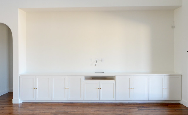
Let’s just talk about the elephant in the room. The 202″ x 83″ elephant known as the untextured placeholder of a wall that needs some wallpaper. Sometimes I just sit on the couch and get anxiety while I stare at it. Obviously I’m dealing with real problems around here.
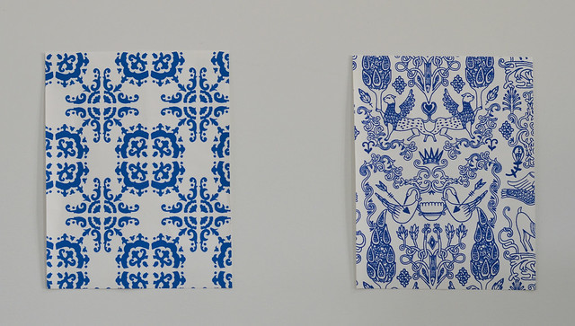
I went to Hygge and West to find just the right pattern and color combo to pull our open floor plan together. I went from wanting a metallic floral to ordering Talavera (left) and Nethercote (right). Makes total sense right? The blue on both of these papers is so vibrant. We both loved the color, but neither was the ONE. The Talavera was too Spanish. We LOVED the pattern of Nethercote, but the scale was too small. It looked like squiggles up there.
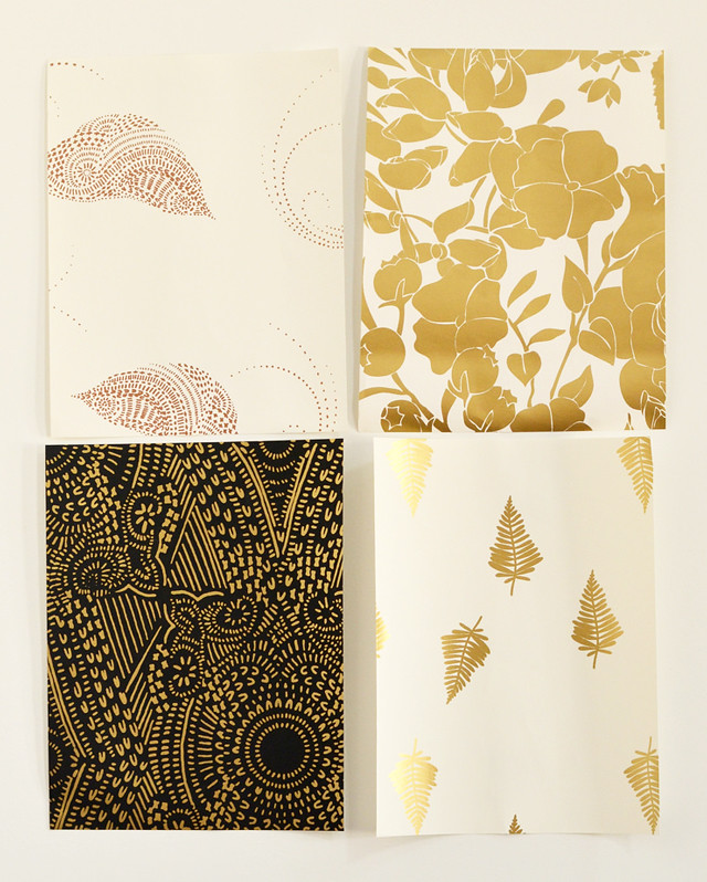
Then I decided I better order 4 more samples and go with my original idea of a metallic paper. Pajarito in Copper (top left) fit well with our red rug. There was a bit too much off white space since the built in and the walls are white. The Ferns (bottom right) was better but still a little too much off white for our space. Garden (top right) was a close contender.
The winner for me was the Diamante (bottom left). I loved the black and gold. The plan is to mount the tv, so I feel like the tv would just disappear with that behind it. Huge win. However when we looked at the repeating pattern, we weren’t sure we’d like it. Might be a little too art deco for us.
At this point I actually said I just wish Anna Bond would do some wallpaper. I never tire of her patterns which was a huge concern of mine when we were looking at the other options. Then Hygge and West announced they would release Rifle Paper Co. wallpaper in May. Incredible timing.
They came in yesterday and I couldn’t wait to blog about it. Seriously guys they are so pretty. Also I cannot decide which one to order. The plan was to order it immediately because I know once it arrives it’s destined to sit for weeks before we actually hang it. Let’s get this show on the road Wills.
The only one we ruled out immediately was the Cities Toile. It would look incredible in an office or library just not in our living room.
So onto our choices…
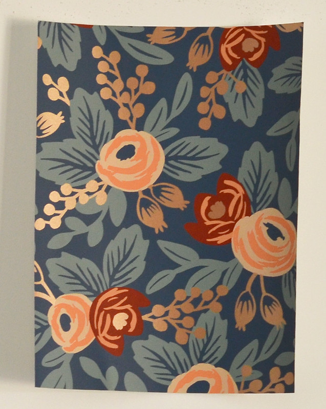
Rosa in Indigo is a classic Rifle look. Love that it’s dark and will make a huge statement. It’s probably the boldest choice and will require more attention to the color palette in the living room, but it’s still neutral enough that it doesn’t scare me.
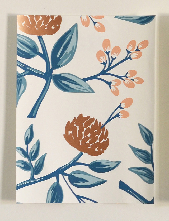
Peonies in copper and…
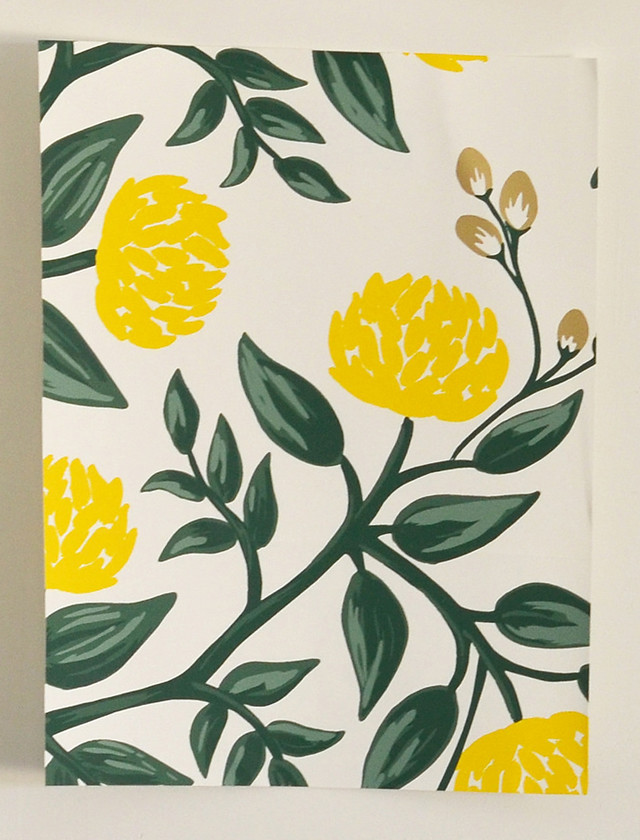
Peonies in yellow
The copper and blue is more neutral. I feel like the green and yellow reads as greenery though, so the yellow won’t clash with the rest of the living room plan (which is kinda non existent at this point anyway).
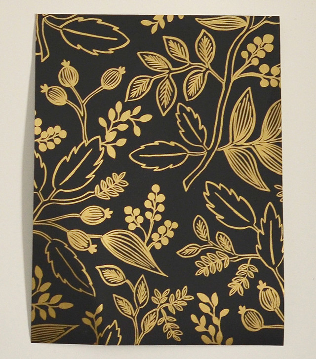
Queen Anne in ebony
It’s dark, so the tv will disappear. The scale is perfect. It’s cheaper per roll than the others.
It’s like having 4 kids. You love them all equally, but you can only plaster one all over your living room wall…okay so I can’t see that analogy through. Point is they are all so good. I don’t think there’s a wrong choice, but I don’t know which one to pick!! What would you do/what do you think I should do??
Update:
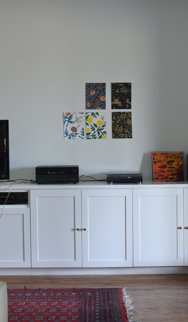
Katja made a great point about showing the samples with a larger shot of the room. You can see the scale better. Ignore the wires and general chaos of the build in. I’m not a temporary solutions type of girl. I will write a post one day about that, so you can see how crazy I really am.



ooooh fun ! i like option 1 and 4 the best!
Those are definitely the bolder choices of the 4!
I like the peonies in copper! Seems like a good balance of white space and pattern. I think it would work well on that large expanse of wall.
That one is really pretty at night/low light too. When I ordered them, I thought that one would be the best fit if the scale was right. Then I got them in and loved all of them.
peonies in copper.
Very good choice!
OMG. Can’t. Choose. What are you doing to me… I keep going: THAT’s the one… no THAT’s the one. For some reason I am very drawn to the Rose paper. But the peonies in yellow or copper are soooo good too.
But then I see your point about the tv. If you go with the peonies, then the artwork almost have to be very white, so that will make the TV stand out a ton. If you go with the Rose paper it has a dark background without being black, which gives you more leeway with art while not making the tv stand out too much. I think…
Do you have art for that wall yet is what I would want to know…? I would love to see the samples taped to the wall for scale
I’m such a great help, aren’t I ? You’re welcome haha….
But no matter what. You have AWESOME taste in wallpaper
We talked about putting art around the tv, but I’m not sure I want to do that yet with the wallpaper. I mean the wallpaper is art at this point. It’s just so pretty I hate to cover it up. Not that we won’t eventually hang stuff, but it will be a wait and see game. Those samples are on the wall, but I didn’t step back and take a picture because there is a mess of records below! I’ll instagram something for you to get a better idea of scale.
Queen Anne in Ebony all the way! When you put up all 5 choices that is definitely my favorite. You get the metallic, the black to hide the tv, and it’s neutral so you can bring whatever you want in the room with it. I also feel like I wouldn’t get tired of this pattern as quickly as the other ones.
Yes it’s a great neutral. Plus it’s cheaper. The gold is super reflective in the light, so it isn’t one dimensional at all. I loved that one when I ordered it, but from the website it looked like the pattern was going to be too small. It’s perfect scale though which makes the decision so difficult!
I like Rosa! Classic and bold, and the dark background will make a great statement. I love Queen Ann too but I think you’d tire of it.
I have never tired of her Rosa pattern, but I am kinda afraid that I will it’s on my wall. I really wish I could order a larger sample and put it up of the final 4! I don’t think there’s a wrong choice but there probably is a best choice. I just can’t figure out what it is right now.
I love it all, but my absolute is peonies in copper. I feel like the peonies give it a homie not in your face feel but the copper adds chic modern feel to it.
Peonies in copper is a great choice. It’s a great scale for the space too.
On one hand, I love how the Rosa wallpaper looks with your rug. On the other, I love the Queen Anne paper because it’s neutral and doesn’t lock you into a specific color palette. Can’t wait to see what you choose!
I can’t wait to see what I choose either. I was really thinking maybe I’d have my mind made up after I slept on it, but I’m really torn. I think I can rule out the yellow peonies. They are gorgeous and I’d love to put them in our half bath, but I think I like the copper peonies more for this space. Still leaves me with a 3 way tie.
I’m also voting 1 or 4! (the one you ruled out was the first one that caught my eye, but since I can’t vote for it…..). Apparently I’m all about rejecting white space. There is probably some sort of deep psychological significance to this….
You should get the Cities on for your library! It would look so good in there. Let’s talk through this rejecting white space business…
I’m so glad it’s you two that have to choose and not me 😉 If I had to choose, I think I would go with the rosa if I wanted classic or the peonies in gold if I wanted something more unique. Good thing is I don’t think you could go wrong with any of them!
The colors of the Rosa are much more subtle in the sample than online. You’re right we can’t go wrong. Who can when you’re putting Rifle Paper Co on your walls??
I’m not feeling the peonies at all, it gives me a grandma’s house vibe (which has its own charm, just not up my alley). Rosa is cute but I wouldn’t put a loud pattern on such a big wall, I might get sick/bored of it. I’m surprising myself here by going with the darkest option, Queen Anne – I’m usually anti dark. For the sake of hiding the TV, why not But that’s me. Since you like all of them so much, I’m sure you’ll be happy going with any
Btw, the large scale picture really helped put everything into perspective.
That’s so funny. When I saw the Queen Anne online I thought it would read too grandma for me. I was glad that it didn’t once it came in. It’s actually a lot lighter in person just because the gold is so reflective! Glad the large scale picture helped out. It was good for me to see how it would look in a wide room shot too!
My vote is Rosa, for the following reasons:
1. Unless the TV you’re planning to put there is really, really huge (like covering most of the wall huge), it’s going to look like a black hole against a paper with a light background when it is off, and maybe kind of dizzying when it’s on.
2. A dark background (even with a brighter pattern) is going to give a more pleasant, theater-like feel when you’re watching the TV.
3. It goes really well with the rug.
4. It carries that touch of navy from the kitchen island across the living room and will stand out as a fresh element with the white walls, black doors and black fireplace.
5. It’s a very classy, timeless pattern.
You are making really good points here Janet! You and Jennifer are not on the same page about this though! Haha!
Ah, but you see, Jennifer and I have very different decorating styles. We both have excellent taste, however.
Haha true!
I am absolutely in love with the now discontinued Obsborne and Little yellow and gray parrot tulip wallpaper that will never be in our humble abode (sigh and double sigh). With that said — #teamfloral — all the way. And a bonus hashtag for Bo….#itsacruelcruelwallpaperworld #brokenheartsclub
They are all floral Nichole!! I think I’ll be heading your way soon to see that (not so) humble abode. I’ll start picking out wallpaper while I”m there! Bo will love that! 😉
Yes they are floral and that is why I love them ALL. I just couldn’t pick my favorite…too much like picking a favorite child…can’t you find a way to incorporate them all??? Oh the humanity. #toughchoices
No help Nichole!!
The yellow and green makes me angry…just kidding…but the green and yellow and white is too “in your face”. And the black with gold is making me think of the gold marker I use to write on dark wrapping paper or envelopes. . It just seems very clear tonite. Peonies in copper or Rosas.
Rosa. That extra ‘s’ snuck up on me like a ninja!
You are crazy and I love you. Queen Anne makes me think about gold sharpie on a black wall but prettier. Ramona votes Rosa. Nick and I are still changing our minds depending on the light. He might just be chaining his mind, so he doesn’t have to hang it anytime soon.
I think you should go with one that has flowers in it.
~Always helpful in Iowa
Gold.
~Crying Real Tears in Texas
I like the peonies in copper so much and since you guys love blue so much 😉 I think it would look great!
Blue is definitely our jam!
I like Rosa and Queen Anne the best. But really, thats really hard- and theyre so freakin beautiful!! what great timing!
I know right!! It never works out that way!
As a statement piece I’d do Rosa. To blend more I’d do Peonies in Copper. Just my designer 2 cents.
Awesome thanks for the advice. The more I think about it. The more torn I am between those 2. Tough call!
All those choices are great! I’m loving that gold Fern print. But the choices you have are going to be awesome!
When I pulled up the links for the post, I realized the gold fern print is on clearance. It’s more than 50% cheaper than the other options. It just won’t work in here though. Bummer.
I love this post!!!!
Okay, while I love all the papers, I think, For This Space, I would do the peonies in copper.
You will get the beautiful blue leaves against white, which will really go well with the rest of the white room. The black and gold is so lovely (and my iPhone case!) but it would possibly be too dark and graphic for the graceful home you are designing. The copper will have staying power. I know it’s right because I’m getting an attack of jealousy right now… This is all so gorgeous!!!
I did a photoshop mock up of the copper peonies, the black and gold, and the Rosas. It only left me feeling more torn over the choices. I am so back and forth. I can see the pros and cons of each. I think any of them will work. Plus I can layer art on top to balance it with whatever winds up happening in the room. I should set a deadline on myself for making a decision or I might be debating for months.
My comment didn’t go through yesterday! Here’s the basic gist of it: Whatever you do, it will be amazing because there is no way to go wrong with those fabulous papers. Also, whatever you do, I will come and possibly drool on it in person, so maybe consider that as a risk/reward factor in the equation. More fabulous = more envious drool.
You know, maybe there’s a reason my comment didn’t go through yesterday and I should have taken it as a sign… 😉
Haha! You better watch it I just might invite you over for a wallpaper hanging party. Yeah I’m going to make that a thing.
Yes! Make that a thing! I actually really want to learn how to hang wallpaper… I suspect something is wrong with me.
Seems like a totally normal thing to learn!
I’m loving the Queen Anne, but I think you’re right that you can’t go wrong with any of them! That Nethercote is FABULOUS, too bad it’s so small!!
Yes the Nethercote is really fabulous. I was really bummed about the scale. The Rifle choices are incredible though, so I didn’t pout for long!
Gorgeous! That wall is the perfect place for some wallpaper. I get what you are saying with the t.v. disappearing into a darker wall – and initially I thought the clear choice was Queen Anne in ebony – but as I look at it more, I think the Peonies in copper is perfect, both with its scale and the amount of white space. Can’t wait to see what you choose! I don’t envy you the decision, but I totally envy you the decision
I know! It’s been such a struggle to pick. I can see why both of those will work great. I also kinda think the Rosa is a middle ground since it’s dark, but not too dark. The Queen Anne is super reflective though, so it reads a lot brighter than you’d expect. I would really love to have it order by this weekend! If I can just make a decision already!!
Um, I love them all. I totally get your not-quite-perfect kid analogy, and so I can’t choose. I can’t wait to see what YOU choose, though. I’m pretty helpful.
So, so helpful!! I would just bring them when we meet IRL, but I want to already have it wallpapered by then!
No, don’t wait! I want to see it installed within the week. #UnreasonableDemands
I think we will both be super disappointed when it takes me several months to do this. #settingexpectations
Girl, those are some great choices! I also have to second (or third or fourth) the Peonies in Copper. It would be so pretty when it catches the light and easy to decorate around. Can’t wait to see it up close and personal once it’s done!
I can’t wait either! The peonies in copper is the prettiest one at night! You will probably come see the house before it’s up because this decision isn’t easy!
I can’t even choose one. This stresses me out so much and it’s not even my house. Any of them will be gorgeous.
I mostly just loved the analogy about loving all four kids equally but only plastering one across the wall. Because, yeah. Totally.
It’s so true!!
Hello. Over from YHL forums. What a great space! Since you particulary mentioned not wanting to have too much white because of the cabinetry, I think the only two contenders should then be Rosa and Queen Anne. They are both beautiful but I believe Rosa is my fav and since your first two choices had blue…… jus’ sayin’ 😉 . The deeper background on these would definitely do a great job of camouflaging the tv a bit.
I actually hadn’t thought about it that way, but that makes total sense. Our minds keep changing with the light. The room is bright all day, and the Queen Anne is really pretty when the sun is up. The Rosa isn’t as metallic as the other 3 options which I’m debating if that even matters. I have ruled out the yellow and green though, so I guess that’s progress. Thanks for stopping by and a huge thanks for your thoughts on the great wallpaper debate of 2014!
I love peonies in copper, it’s safer – but really beautiful. If it’s too bright/white for you – than I would choose either rosa (fun!) or queen anne.
The peonies in copper is so beautiful in person and at night. The stems and leaves are large enough that I don’t think there’s too much white like the first samples. I just don’t know if the tv will look as good mounted on it. If you need any wallpaper samples for the new Jenkins casa I know where you can find some!
I was almost going to say “go with the Copper Peonies and then I took one more look. In that second, I went for the Rosa. Scary how our decorating decisions can change on a moment’s turn isn’t it? As I looked one more time at the Copper Peonies, I thought you might still have too much white on that huge wall. I was immediately drawn to the Rosa largely because the colors in the paper play well with most other colors, which would free you up with other decorating accents. I wondered for a second if maybe it might be too dark. Then, in that last glance, the Rosa said “it’s me!”
I wish my gut was telling me which one to pick! I’m having a tennis match in my head over this! Thanks for the input!
I little late to the wallpaper party but I figured I would put my two cents in. I like Rosa and Queen Anne the best. However, Queen Anne lacks depth because it only has the two colours, albeit gold (swoon!). I like the Rosa best because it creates a real feature wall and doesn’t blend with the cabinets and it has depth because of the multiple colours!
It’s okay the wallpaper party is still going on. I wanted to have it ordered, but I’m still struggling to pull the trigger. The Rosa is definitely the biggest statement. Queen Anne doesn’t read as one dimensional as you would expect since the gold is so reflective, but at night the it is so dark. From the kitchen it doesn’t look as reflective straight on either. It’s been interesting to see how all the wallpaper changes in different lights and angles.
Pingback: Wallpaper Revisited | Wills CasaWills Casa
Loving the wallpaper. I have a nearly identical wall in my house that’s being constructed now. This has been a great inspiration for what to do there. I’ve checked out the Hygge & West site and found some samples. Are there any other brands/sites you love for wallpaper? Thanks!
Thank you! I knew I wanted a Rifle paper in here, but I’ve found some pretty papers from Walnut Wallpaper and Cole & Son.