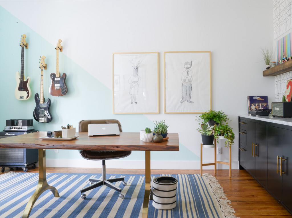
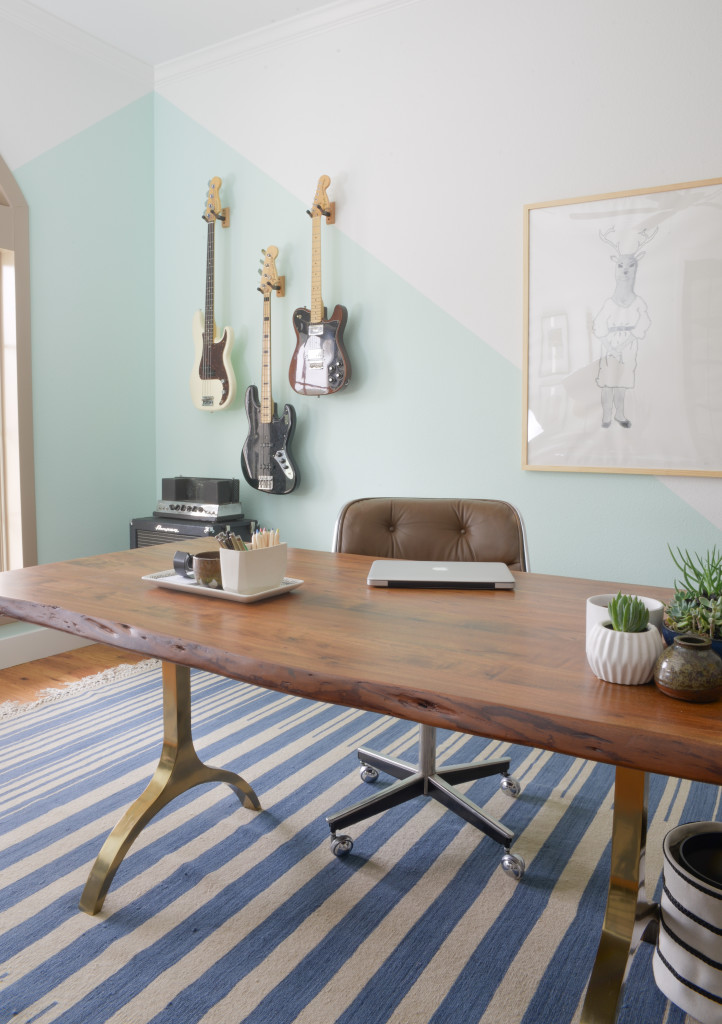
It’s finally here! Reveal day for our One Room Challenge! It was exhausting but oh so worth it! Nick has a beautiful office that isn’t an eye sore when you walk into our house! It’s a real win for everyone.
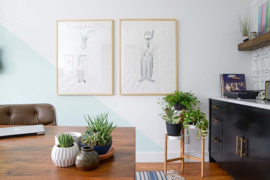
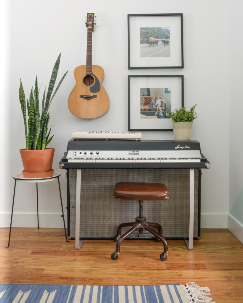
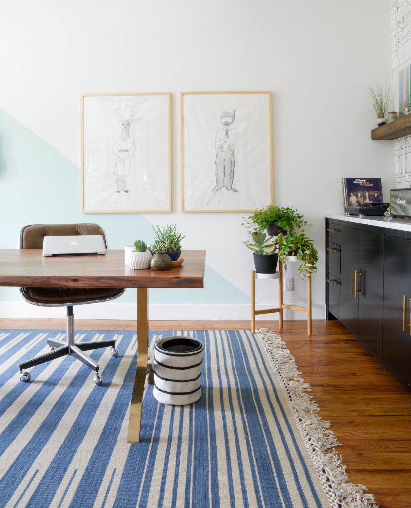
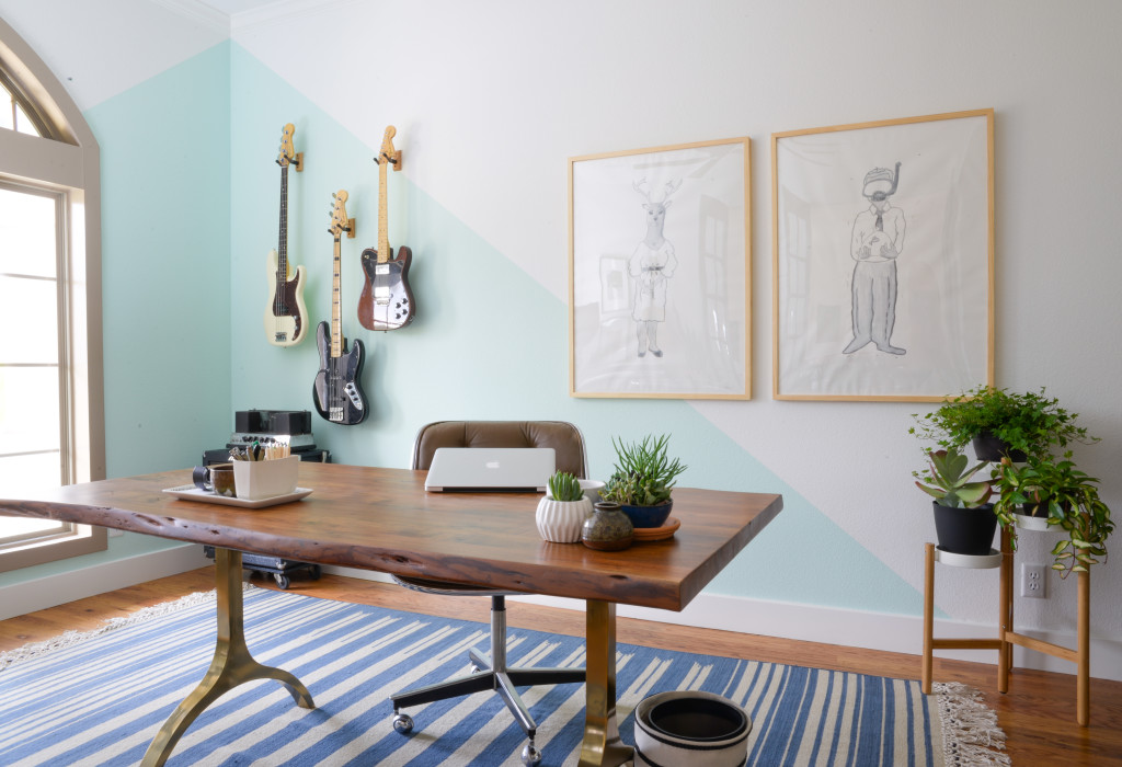
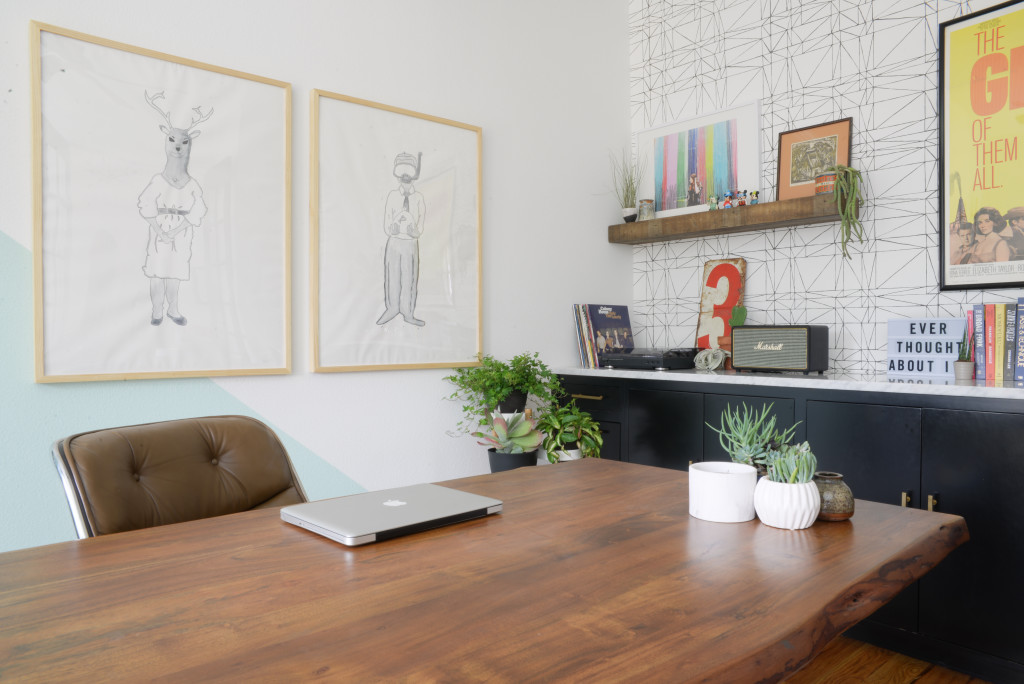
After we hung the guitars, I got a lot of feedback on what to do in this space between the guitars and the built in. My insanely talented friend Katja suggested some large art. Time and budget crunches led me to purchase two 30 x 40 natural wood frames. Nick had done these sketches in 2007. We thought they’d be perfect if we made them larger for these frames since they are simple with a lot of white space. Add something to this area but nothing too over powering in the room.
I feel like we accomplished that! Also it’s pretty cool that a blast from the past (sketch book in this case) was reinvented to become original art in Nick’s office. He made them using pen and watercolor.
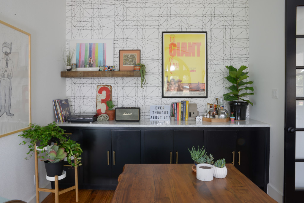
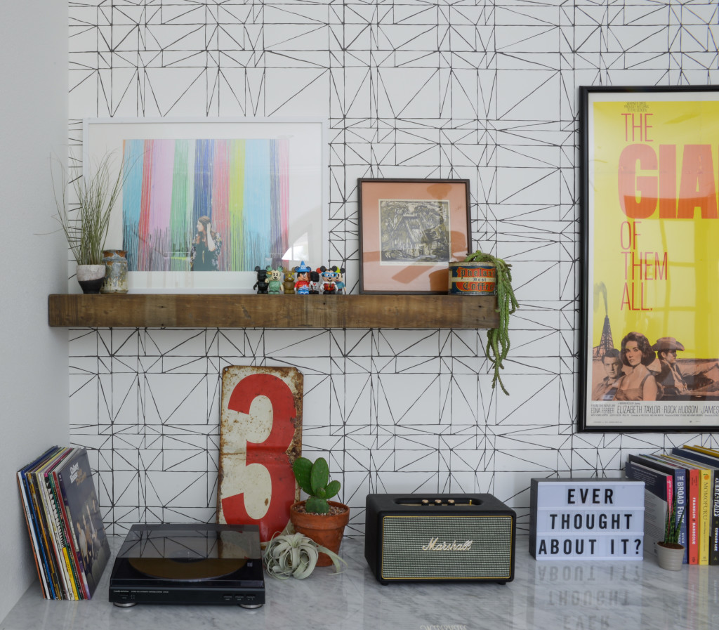
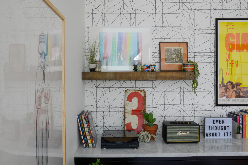
The wallpaper above the built in was always gorgeous, and it just got better once we started pulling this are together. We’ve had the Giant movie poster for years. It is so, soooo good to see it up!
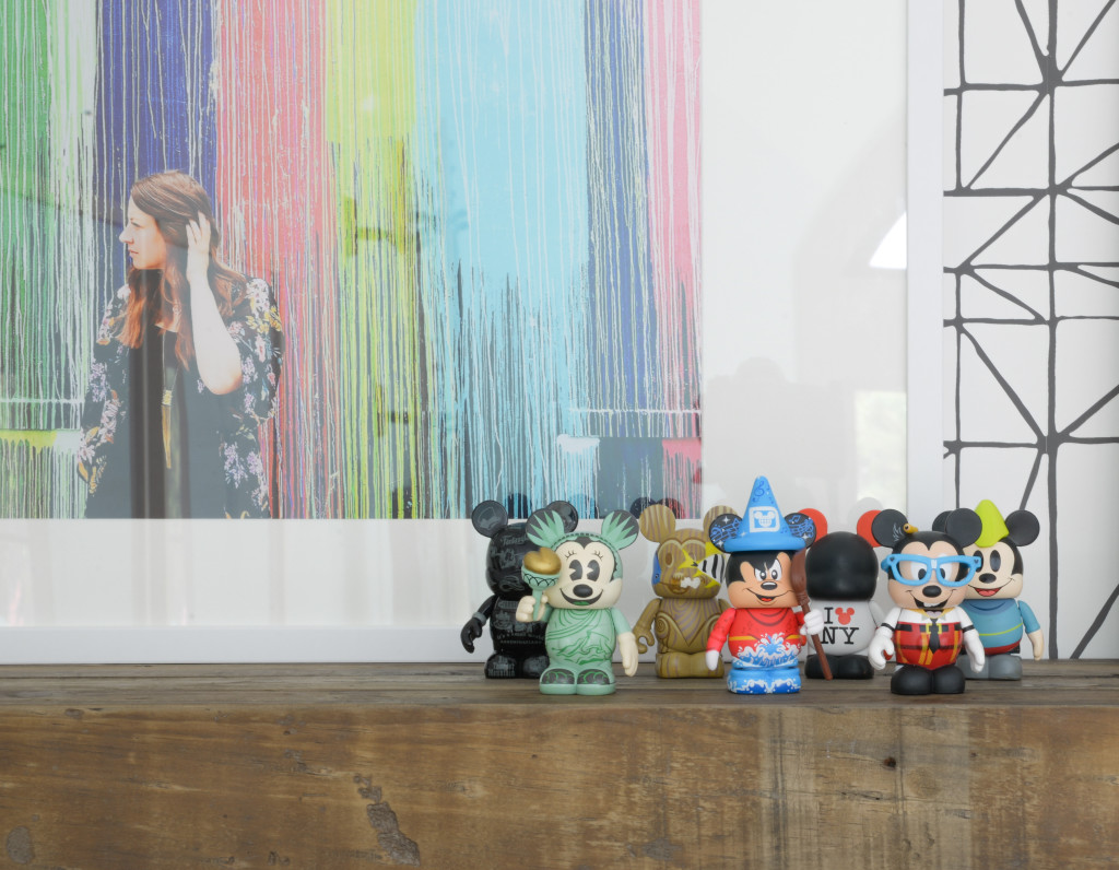
Nick has this collection of Mickeys. His first Disney visit was when Ramona was almost 2. I insisted he get something to collect for each visit. He thought it was dumb, but here we are 7 Mickeys in…and some aren’t from Disney vacations just souvenirs from regular vacations.
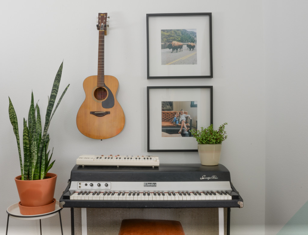
Nick’s Rhodes has always been a show stopper in this room. It’s nice to see it styled. Yes there’s another guitar on the wall and a vintage Casio keyboard from our Thrift Store challenge ages ago. Fun fact Nick actually played it on stage last weekend. I should have gotten a video as evidence.
Sources
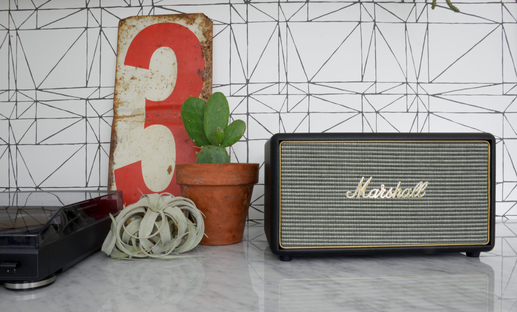
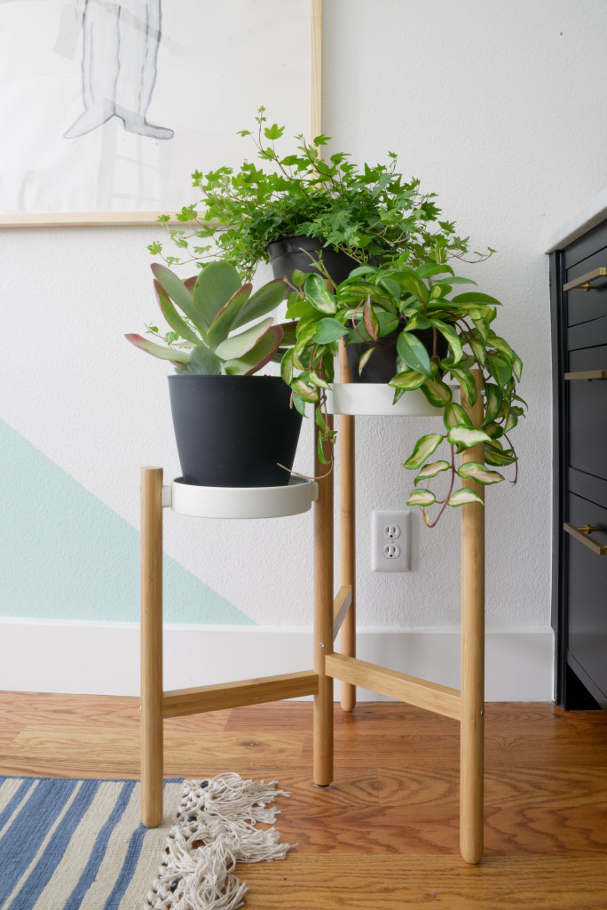
30×40 Natural Wood Frames / Watercolor Paper / Desk / 3 Tiered Plant Stand / Round Plant Stand / RIBBA Frames / Cinema Light Box / Marshall Speaker / Reclaimed Wood Shelf
Thank goodness for the One Room Challenge that lit a fire under us and got this room pulled together! Make sure to go check out every else’s rooms!
SEE THE FEATURED DESIGNERS HERE
SEE THE GUEST PARTICIPANTS HERE


this is awesome, as i knew it would be! i love all of the special art, and that poster is fantastic!
Thanks Cassie! It all came together in that last stretch. Now we need to figure out a way to celebrate with a drink!!
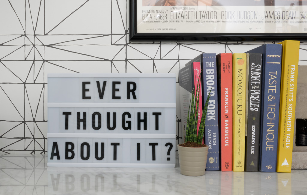
PS- why yes, i have thought about it.
Same. 😉
I love it all – but I think my favorite part is the wallpapered area above the cabinets. It just looks so pulled together. Love all the little personal details.
Thanks Kim! Nick managed to pick the most artsy options in our personal photo library (also known as our Instagram feed)!
OH MY GOSH it is SO GOOOOOOODDDDDD. I love it. All of it. Yes!! So much yes. You should take up blogging lady. Oh wait… 😀 I declare success!!
LOL well I literally couldn’t have done it without you! Thanks for responding to all my pictures and using your eye to make all those styling tweaks! If I wasn’t so excited about what you’re going to do at the new place, I’d ask you to just move in with me!!
I can’t handle how good this is! Great job Amber!
Haha thanks Tiffany!
very cool coffee and love that wall treatment … simple but very effective and love that wallpaper too! great job to wrap up week 6 #OneRoomChallenge!!
Thanks Tim! It was a whirlwind but glad it all came together in the end!
Wow–this is such an amazing space now! yay! I spy your Yellowstone bison photo :). And you’re lucky you can style the keyboard; my kids won’t let me put anything much on top of the piano because they say it rattles around while they play. Priorities, kids!
The infamous bison picture had to make an appearance somewhere!! I figure the plant won’t live long enough for rattling to be too much of an issue!!
Amber!!! This is awesome! I absolutely love it!!!
Thanks Brynne!!
I really love the way it came together! And I love that you made the space look gorgeous, while still reflecting your husband’s personality and style. I feel like that I can be really hard sometimes, at least for me and my hubs haha.
It was a total team effort for sure. By team effort I mean Nick knew what he wanted to do and I just carried out that plan! Haha well there were tweaks throughout the way too!
This is such a cool office!!! The low cabinets with the wallpaper is so awesome, and I’m just completely in love with how you styled the space. Looooove it!
Thanks Shelley!
This office is so cool! I love the slanted sea foam colored walls. I might have to try that in one of my spaces…
Love this. Especially the walls, both the paint and wallpaper. Where is that rug from?
It’s from target. https://www.target.com/p/stripe-area-rug/-/A-53272852?preselect=15046213#lnk=sametab