Now that the layout of our new house is established, we’ve been trying to get ahead on thinking about the design. We hope that allows us to make quicker decisions, get what we want, and maybe even save some money.
Specially we are exploring pattern in our design choices which is convenient because it’s my monthly challenge for June! Just to clarify in case the opening image threw you off, we are looking at pattern in the house not on it. (Although I would totally be into a polka dotted house if the HOA was cool.)
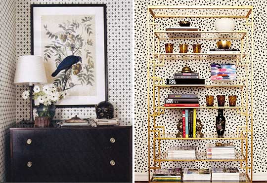
We know (or think we know) we want to do some wallpaper but probably not an entire room. I love both of these black and white options. They are simple in both color and pattern that it wouldn’t limit the room in the future.
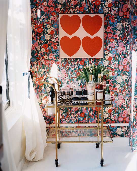
There is definitely a part of me that wants a bold wallpaper too. I mean what an incredible impact on the room this floral has. I wear of patterns easily though, so I do worry about going so bold then being over it in a month especially since wallpaper is not cheap.
We could always go the stencil route since it’s cheaper and much easier to change in the future.
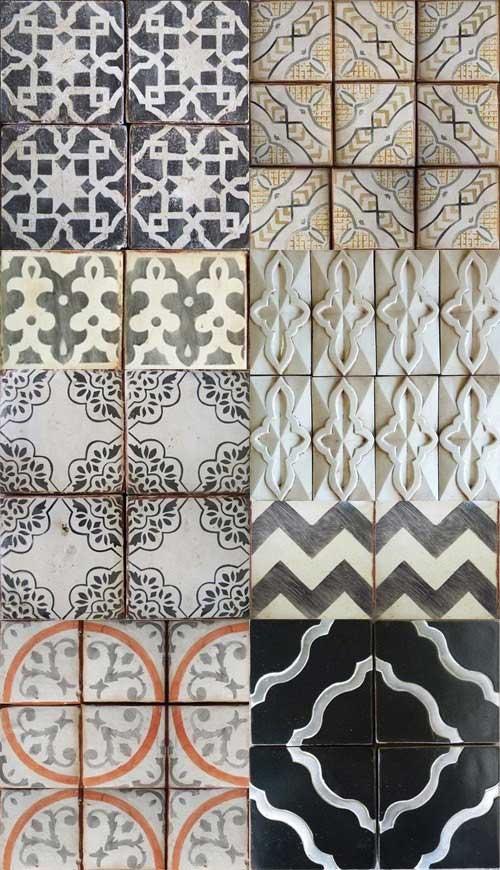
Tabarka Tile via
Then there’s the matter of adding pattern in the form of tile to the house. It’s much more expensive than standard tile, but goodness it’s gorgeous! I do have the same fear of it wearing on me since it would be such a permanent thing.
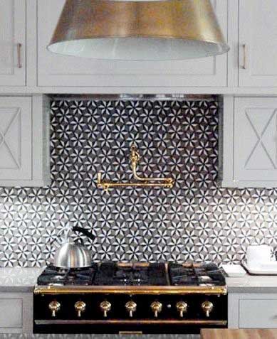
But seriously how amazing is this patterned backsplash?? If you keep the kitchen neutral (and have a badass range), then it makes such an amazing impact on the space.
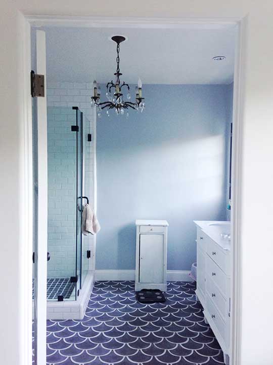
I have been obsessed with this bathroom since Emily Henderson posted it on Instagram. It’s a pattern, but it’s also not too busy. I love me some scallops (the pattern not the food).
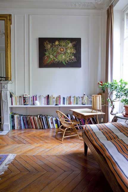
We are very interested to see what the price difference between laying hardwood the normal way versus in a herringbone pattern. We love the herringbone look but seriously doubt it will be in the budget.
Basically we are trying to find a balance between adding our style into the home but not so much that no one will ever want to buy it. Patterns are a tricky thing sometimes.
How do you feel about pattern? Go bold or go home? Put it on the wall, the floor, or neither just leave the pattern to the textiles? Don’t worry we’ve made zero final decisions, so your opinions are very much appreciated!
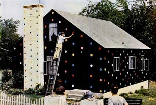


Yes please, I need a polka dotted house. STAT! I think that is Pippi Longstocking’s house when she grew up. To match her horse. I totally love it!!
Love the herring bone and the scallops too – also not the food, just the patterns on both accounts :). I think the one you are showing is technically a chevron pattern because the ends have been cut at an angle?
Did you see that LGN is planning a little bit of that in her new house. Can’t wait to see that.
Yeah I think you’re right about the floor pic actually being chevron. I couldn’t find a good upclose pic of herringbone. I didn’t look to hard though because I figured it didn’t matter too much since we probably can’t afford to put them in! Haha. I did see LGN was doing that in her new place. Her house is going to be so epic. I love her style.
I’m a keep it clean with the harder stuff and add pattern with textiles kind of gal. That would probably change if my budget (and foreseeable future budgets) were unlimited, but as they are not, I like the idea of keeping spaces relatively neutral so I can change decor rather easily if my heart so desires. I will say that I’ve thought about doing some paint patterning because it is so cheap and easy to change – but that’s about as permanent as I feel comfortable going.
That’s typically my choice too. I think I might be able to tolerate a neutral pattern in a small space though. Testing my theory out with paint is probably the best play just in case.
Love it. My mother in law just put a gorgeous wallpaper in her bath. It’s a gorgeous modern turquise with florals. But since she has wainscoting, it doesn’t overwhelm the room. Looking forward to what you do.
Yeah think having something in the room to keep it from overwhelming the space is key. You should post a picture of your mother in law’s bathroom!
This post made me come to a personal realization, which is that I derive a lot of JOY from patterns. They probably make me happier and more content than any other design decision I make. And for me, that will trump any resale anxiety (although I might change my tune when it actually comes to that point).
I do agree with the comment that a lower risk option is to bring it via textiles, but I’ve also splurged on Jonathan Adler wallpaper (http://www.jonathanadler.com/Greek-Key-Wallpaper/?cat=1097&initial=4926), and this tile (http://www.overstock.com/Home-Garden/SomerTile-12.5×12.5-in-Morocco-Glossy-White-Porcelain-Mosaic-Tile-Pack-of-10/4798935/product.html). I think the key for me is getting them in a somewhat neutral color that offsets the boldness of the pattern itself.
Just go for it. You’ll know when it’s too much.
I absolutely love that wallpaper and tile you have! What great items to splurge on.
I think you are exactly right! Staying neutral is key when you are going for a pattern that’s going to have to stick around for a while. I also can’t build the house always thinking about resale. At some point you have to get the look you want just because you want it regardless of someone else hating it later…they can DIY it and change it later right? Unless that someone else is me and dang I hate that I just made myself redo something.
Thanks for the vote of confidence on knowing when it’s too much. I think it will come down to more of a money issue than a pattern issue, but I will see what I have up my sleeve to tackle both things!
I am with you on the wallpaper. It’s SO beautiful. But I change my mind so often, and pattern trends change so quickly, that I like to stick with stencils. But that backsplash is killer! You should do it!
We can’t afford actual wallpaper, so we’ll probably end up using sears catalogs. same diff.