Tile Situation for the Kids Bath

Happy New Year everyone! 2013 was crazy. I’ll spare you a roundup since I know you’d rather see me get in real time with the house. It won’t happen. I’m too far behind, but it is 2014 and we are still building. So there’s that. (Remember that time we built a house and thought it would be done in September or at the absolute very latest Christmas…we were so silly.)
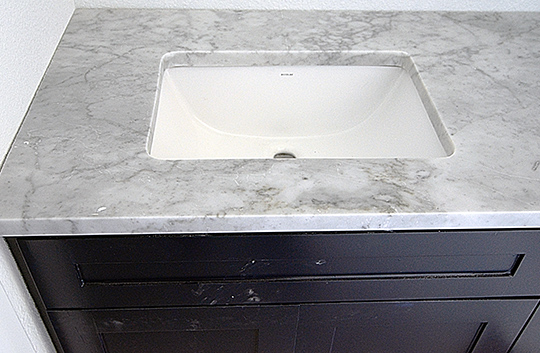
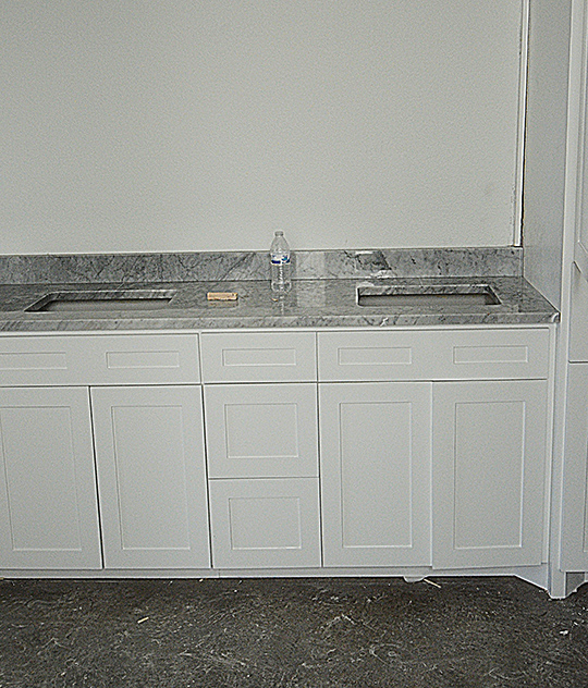
Let’s focus on the Jack and Jill bath for the kids shall we. We had already picked out tile when the whole countertop drama happened, but the countertops were installed before the tile hence the blogging order of such things. To bring you up to speed the last update was our navy flat panel cabinets with our (very gray) carrara marble countertop as seen above.
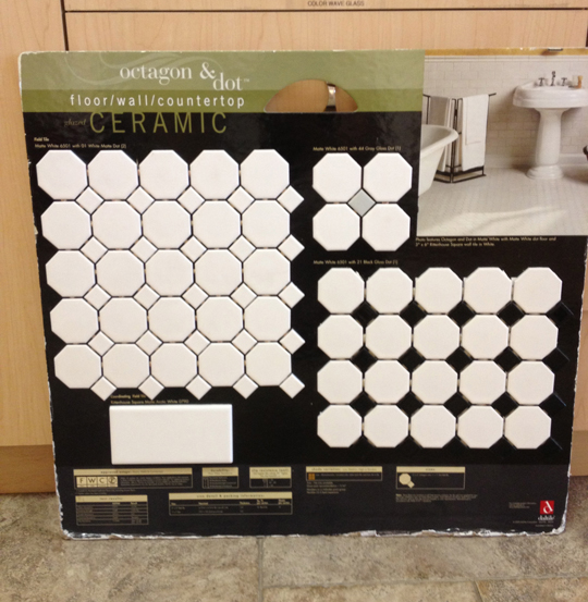
It is a little weird how quickly we made tile decisions. There are millions of tile options out there, but we knew the octagon and dot tile would give us the look/feel we wanted for this bathroom. We only had to decide on a color – white/white, white/gray, or white/black. I ruled out white on white immediately. I didn’t want an all white floor. I felt like the black or gray would break the floor up enough to avoid all the cleaning issues people have with white floors.
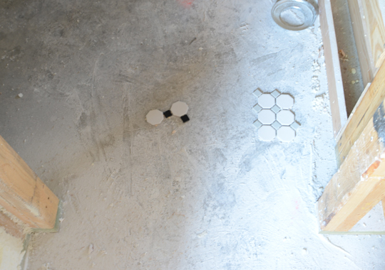
We have tried to focus on getting that older look within the house. Stick to the oldie-but-goodie mantra. The octagon and dot is pretty textbook classic tile. Plus the kids bath is pretty narrow, so using smaller tile in there makes sense. The white/black had too much contrast for that area. It was also a little too 1950s for what we were going for. White/gray combination was the winner. Subtle but enough contrast to give an interesting pattern that wouldn’t be too overwhelming for the space.

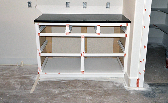
Here’s Ramona’s vanity. The counter is slightly grayer than the tile which I am happy about. I still don’t love the countertops, but I think they look pretty lovely with this tile and the navy cabinets. It’s only uphill from here. (Hardware squeal!)

*Sorry I didn’t take the plastic tarp off before this picture. I always feel awkward taking pictures while people are up there working, so I try not to touch/rearrange anything.
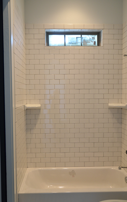
We did subway tile for the shower area. Shocker. We went with natural grout instead of white like we did for the kitchen. Mainly because I didn’t want white grout on the floor tile, so I figure natural gray was the best choice for the floor and shower. Simple and clean.
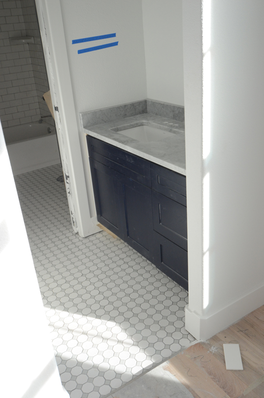
You can see all the pieces in play from Beckett’s room – the tile, cabinets, countertops, pocket doors, arched entry (imagine that at the top), and a peek at the shower. I’m thrilled with how the kids bath came together. It feels modern but has a lot of character.

Anyone ever cleaned these floors? Is it going to be a short honeymoon period before I want to rip them out? But seriously who cares about cleaning pains when the bathroom looks this good!?!

Tagged As , , ,

From our family to yours…

CARD_2013_blog

From our family to yours, Merry Christmas. Thanks for such a great year!
There are no tags for this post

Painting the Brick

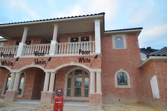
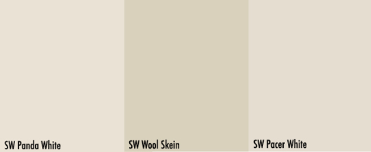
Yesterday I talked about our cast stone getting installed. It had a lot of red to it, so it posed a challenge when selecting an exterior color. The plan had always been to paint the house a cream. We started with 3 swatches (all from Sherwin Williams) – Panda White, Wool Skein, and Pacer White.

The Wool Skein was too similar to the color of the cast stone. I really wanted the Pacer White since I used that color on our bentwoods. I though it would be a great story, but I didn’t really care for it once it was up. We weren’t overly thrilled with these options. They had too much brown in them, so we decided to go lighter.

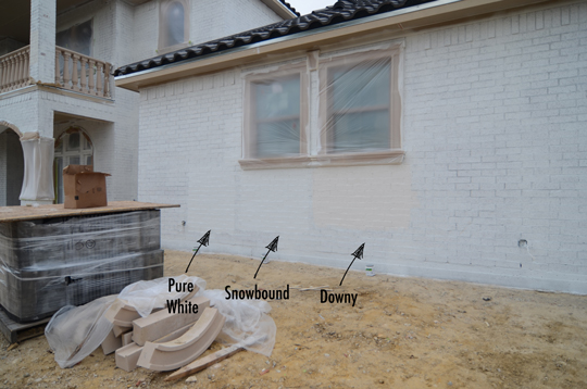
You can barely tell the difference between Pure White and Snowbound on the swatch, but we had already painted Pure White inside. We had it on hand and figured why not test it out.

Of course there was a difference in the swatches once they were on the wall. The Downy was a little too peachy especially with the red in the cast stone. The Pure White was a little too white.

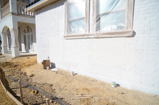
All 6 of the swatches we painted looked nearly identical in the direct sunlight. The camera shows a better distinction between the swatches than there was in real life. We decided to go with Snowbound since we liked it the most in overcast weather and at dusk where you could actually distinguish a color.

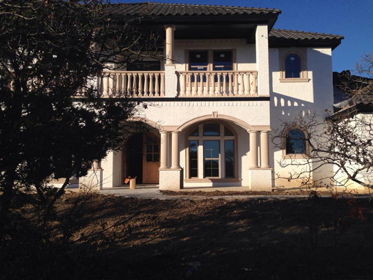
Honestly we weren’t really liking the color once it was up. It was so stark. It also made the cast stone look peach. We were pretty upset but weren’t sure exactly how to fix the problem. Go a different direction with the paint? Paint the cast stone? Cry in the corner?

via

I talked to Katja about it because that’s what friends are for. She sent me this image which made me feel a little better about the way the house looked. I had to think more about a solution, so I took to google for more inspiration.

via

I love this house. We had painted all the accents black already, so maybe painting the cast stone the same color as the house was a good play. The only thing that I wasn’t sure about with this is the windows are white while ours are almond. I don’t know if it’d be too big of a deal but definitely worth noting. Also the stairs look like the cast stone is gray (and more along the lines of what we thought ours would be).

via

I found this image which I felt looked very similar to what we currently had especially with the rounded accents. Maybe landscaping would change how I felt about what was going on.

Ultimately, we decided to leave it as it is right now. Cast stone lightens with age, so we thought maybe we will give it some time. I really didn’t/don’t want to paint the cast stone but won’t hesitate if it gives us a look we love. I’m not opposed to repainting the house either, but I’d rather wait to do that until I am more sure on what direction to go with it. Also getting landscaping in there might completely change the dynamics.

If I’m being totally honest, I really don’t want to delay the process especially on something I don’t have a clear vision for.

There are no tags for this post

Cast Stone

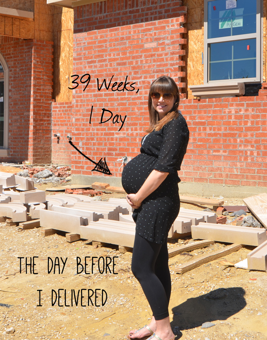
I don’t know if anyone noticed the background on my belly + house post about our cabinets. I’m sure the giant belly was a distraction, so I’ll forgive you for missing it.

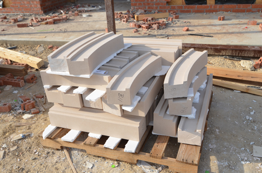
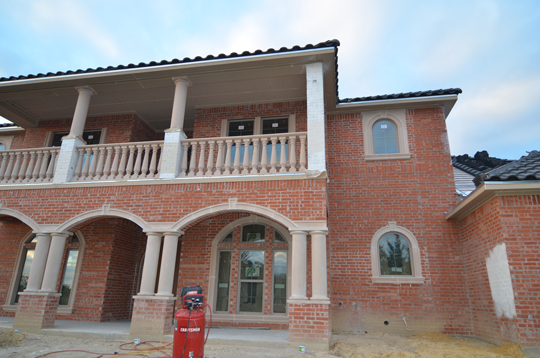
Our cast stone arrived for just the right amount of architecture detail to the casa. You can’t tell in this picture, but it had more red in it than we anticipated. Shockingly so. If one can believe the Wills are shocked by such things. (We are, and it happened.)

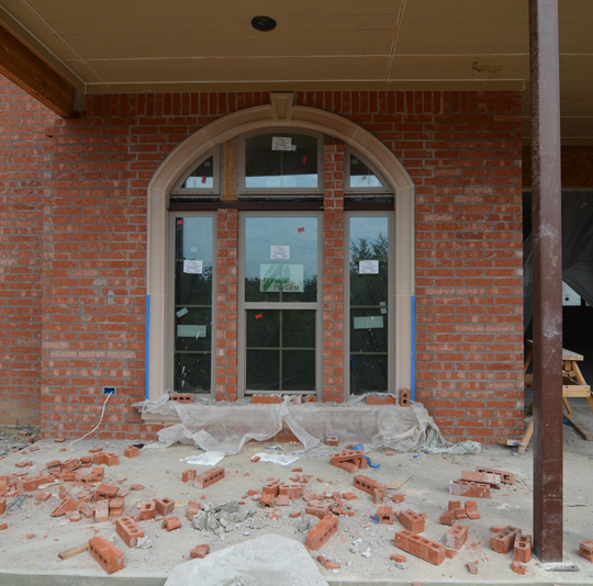
The cast stone was put on all the windows in the front. There was supposed to be stone in between the larger windows where you see brick, but it didn’t get delivered for some reason. There was lots of confusion surround it.

Luckily we have a blog, so we pulled our plans to confirm there should have been cast stone there. It was already bricked on one window, and there was no cast stone there. We just went with it.

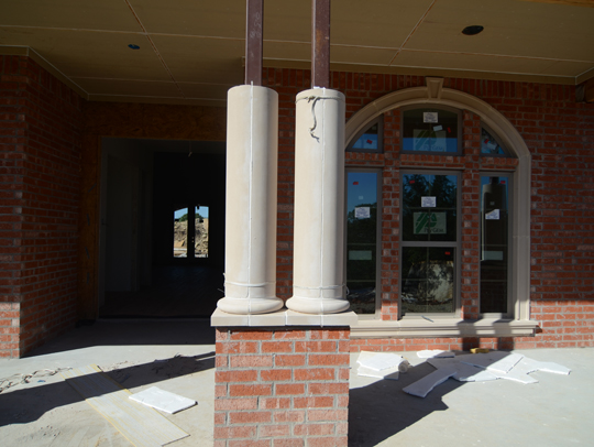
Once Beckett was born and we were out of the hospital, we walked up to find this. Our columns installed incorrectly. The seams were facing out instead of to the side. It was a sad day. They asked if they could try to patch it.

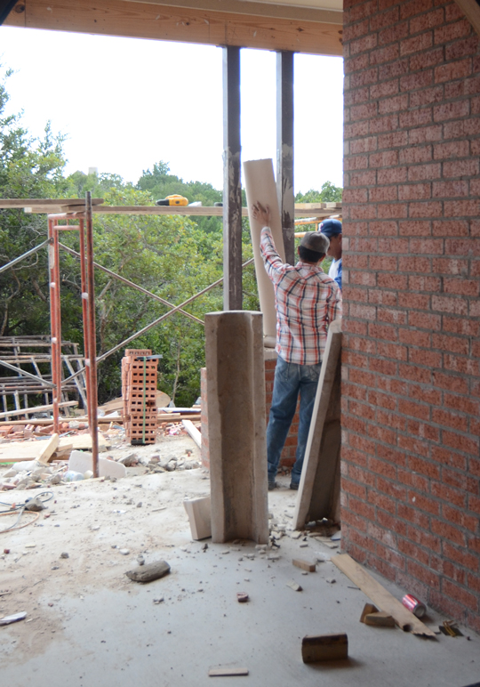
We said absolutely not. So they came down. There was no way they could make it smooth and seamless if they tried to patch. It would have made a bigger mess of the mistake. That can’t be what you see when you walk up to the house.

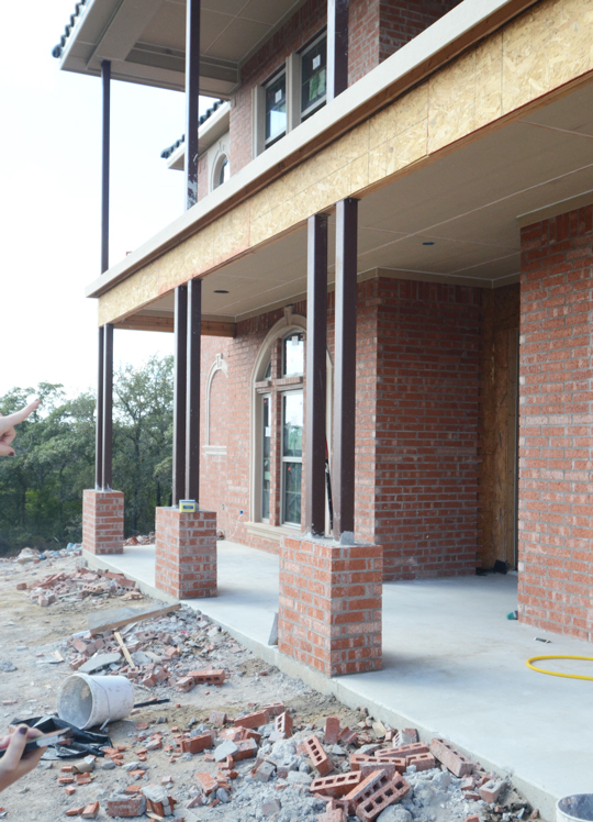
Once the columns were fixed, the arched stone went up. The outside isn’t nearly as exciting as what happens inside, but seeing the arches go up was very exciting. We could see how our front porch was shaping up. A lovely thing indeed.

Sorry for the crazy angles, but there’s no way to get straight shot of the front of the house since there’s brush and a drop off so close to the house. There are 8 columns on the front porch and 2 on the balcony.

Finally the balusters was installed. So shapely on our boxy house. I was worried the railing would be too short. I had lots of fears about the kids being up there especially since the playroom is off the balcony doors. They are 43″ tall. Not that I’ll be letting the kids out there by themselves, but I’m glad they are tall.

You can see the swatches go up. Now on to the brick painting…

There are no tags for this post

She’s a Brick

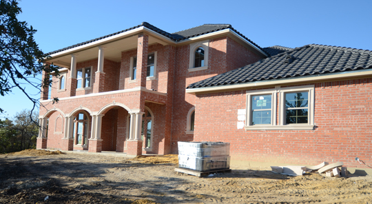
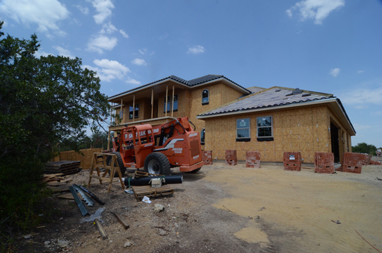
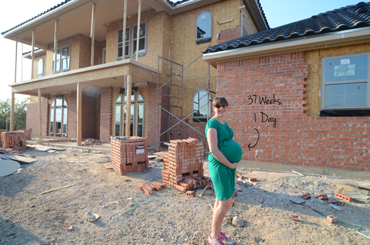
I could have gone with She’s a Brick House, but I’m calling back to some good ol’ Ben Folds for this post. If you ever sneak up on me while I’m cleaning there’s a 99% chance, you will catch me belting out that tune. I digress. So back when they were putting on the roof, they were also putting up the brick. (Sorry for jumping around, but I really wanted needed to talk about the kitchen.)

**Look how gorgeous the clouds are in that picture. No photoshopping on it at all.

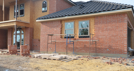
They placed the piles around the house. That’s how we knew it was go time.

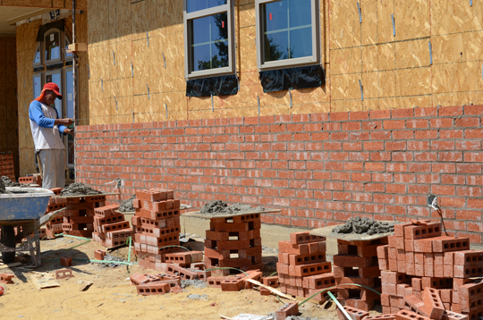
It was crazy to see it climb the walls from day to day. The color was hideous, but the plan was always to paint the brick cream so it was no big deal. Although looking at this picture, the color isn’t that bad. Trust me in real life it was much worse.

Baby Beckett was still cooking at a basketballs pace. 37 weeks and 1 day a mere 15 days before he arrived. Funny there was a time when we thought we’d be moving in before or right at his due date. Ha.

Notice they didn’t brick around the windows. More to come on that friends. A little architectural detail we included.

And a little of this too. I just noticed my hand in the bottom left of this picture. I’m holding a pen and no doubt my notebook. A girl’s gotta be taking copious notes. Always.

Happy Tuesday friends! If you need me I’ll be singing some Ben Folds while vacuuming and such.

There are no tags for this post

Backsplash

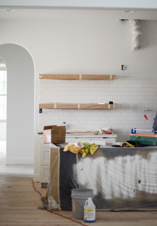
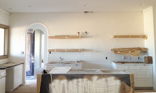
Once our countertops (sans the island) were installed, it was time for the backsplash. We love the view into the kitchen. It’s a huge wall with an arch that has become our building love language of sorts. (Workshopping the motto, “Put an arch on it.”) Huge wall means huge statement right?

We went with white subway tile. Why? Because it’s classy. Plus it’s inexpensive. Also 99% of the kitchen I love (i.e. pin) have white subway tile as the backsplash. (Same percentage applies for bathrooms too.) Shouldn’t mess with a good thing.

With just having open shelving on that wall we decided to do something big.

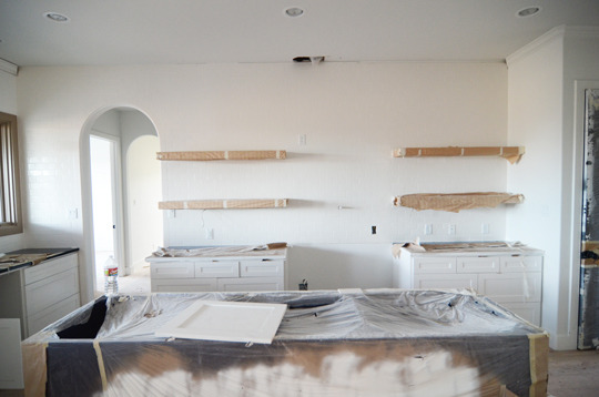
Why stop at the top shelf? Let’s do the whole dang wall. I was worried about the kitchen looking amiss without upper cabinets, but the wall of tile was the cure for that. There will be crown molding at the top, but they have to wait for that until the vent hood is installed.

Love how the tiled arch looks (this picture is without grout). I am slightly terrified that I will hate the open shelving and have this wall of tile that pretty much commits me to the shelving regardless. Only slightly though and I feel like that can be contributed to the several “it’s not my style” comments I got from my mom and sister. True story. The tile guys said they’d never done a job like this and “maybe people will like it.” Nick and I died laughing. Confirmation of what we already knew, we be cray.

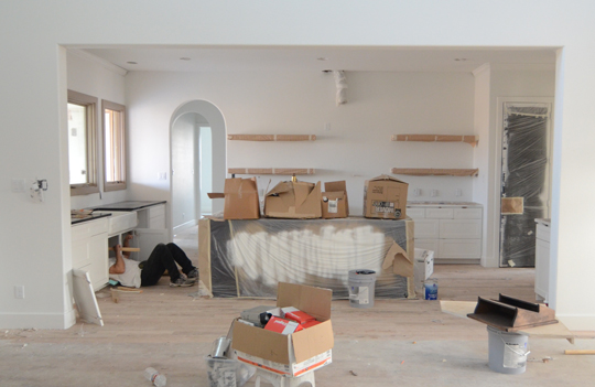
We decided to go with white grout. It’s hard to even tell the whole wall is tiled in this picture. Once all the window coverings from the paint are off and the glorious natural light returns, it will look amazing. We thought going with natural grout which is a gray would be too high contrast for such a large area especially since there will be a ton of items displayed on the shelves.

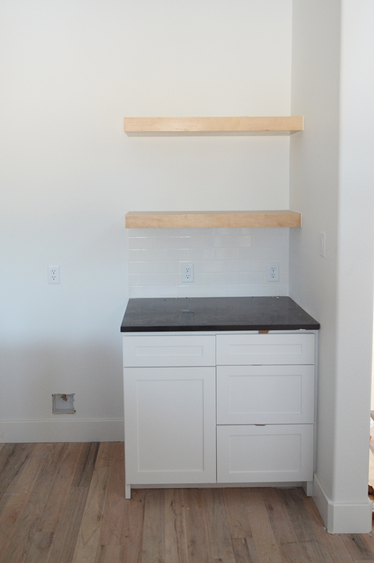
You can see how the kitchen is shaping up in Nick’s coffee station. The natural stained shelves, black granite, white cabinets, and wood floors. The floors still aren’t finished, but I am really loving the lighter natural look in the photo.

Getting really excited friends!

Tagged As ,

A Tale of 2 Carraras

After the revelation yesterday that I’m a total drama queen when it comes to countertops, I figured I’d share more on that subject since I apparently love it so much. The countertops in the master are already installed. Not much we can do about it even though they weren’t supposed to be. Okay I will stop before we go down that road again.

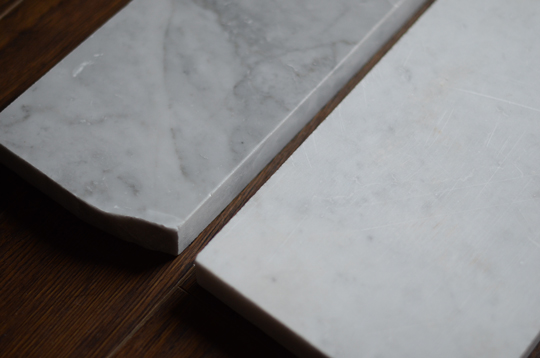
The problem is the counters are too gray, so we thought maybe honing the stone might give us more of the look we wanted. We had a sampled honed before we made any commitment. We were told there is no difference in durability, etc between the 2 options.

It’s definitely lighter, but there isn’t much marbling left though. It’s almost like a white stone with gray specks. What do you think? Is one better than the other?

Note this has no effect on the island. We still need a solution for that.

There are no tags for this post

Baby Mama Countertop Drama

Today I’ll be talking about the process of picking out countertops for the house. It’s  been a long / arduous endeavor, but I’ll try and keep this post from growing to War and Peace lengths.

Back in early September, we started the process of picking out countertops for the whole house. We needed to pick countertops for the Kitchen, Master Bath, Kids’ Bath, Office, and Utility Room.

We went in with a pretty clear vision for what we wanted: light (more than likely marble) countertops on pretty much everything except the white cabinets in the kitchen. On the white cabinets in the kitchen, we wanted a solid black granite.

So the first thing we did was go to a granite slab yard. And the first thing we looked at was a black granite for the kitchen called Absolute Black. It was spot on for what we wanted for the outside cabinets in the kitchen.

I figured that it would be cheaper than some other options since there was little variation, but it turned out that it was an upper-mid lever grade of granite… a bit more on the expensive side. That’s pretty much par for the course on this build.

So after we decided the black granite looked good, we were told to go to our fabricator’s shop and look at some marble samples (not actual slabs, a key detail to remember for later in our story).

via

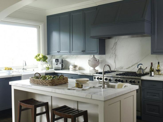
We wanted a whiter stone with gray marbling like the kitchen above. We showed up to the shop, looked at some carrara marble samples, and went home with visions of white marbling dancing in our heads.

About 2 months later we got a call from the builder that some of the countertops were being installed. Of course, we went up there that afternoon to check them out. The black countertops on the white cabinets were straight forward and looked like we wanted them to. The problem was…

The carrara we got was extremely gray (almost no white at all). Admittedly, it looks pretty great on Beckett’s bathroom sink, but it wasn’t anywhere near what we were expecting for the Kitchen island in particular. The countertops had already been installed in the kid’s bathrooms and the utility room.

This was met with pretty much a full on hour of panic and freak out mode. We spent the whole time in the fetal position rocking back and forth, crying and listening to coldplay. We told them don’t do anything else (cut or install) until we came up with a different solution for the other areas (Master bath, Island, and Office). We were under the impression that nothing else was cut at that point.

Amber had been talking with the granite guy about options, but there was still no solution when my mother-in-law happened to stop by the house a couple weeks later. She called Amber and told her they were installing carrara in the master bath.

Amber rushed up to the house and pretty much lost it. She had her first real crying breakdown in front of the granite people and the electricians.

Amber Edit: What makes this better is I was in my pajamas with no makeup and ratty hair. I’m already an ugly crier then you add in that mess. Not pretty folks. I was furious which led to a heated (yet oddly cordial) discussion with all parties involved. The point is I said don’t do anything only to find it being done anyway. 

Since the pieces had already been cut, changes would mean eating the cost (marble don’t grow on trees…or maybe it does. I’m never quite sure of these things).

Amber (again – sorry I’m still very upset/emotional about this): I felt like a total brat crying over countertops. It’s not that it isn’t a beautiful stone. It’s that it wasn’t what I expected and not quite what I envisioned for those spaces.

The fabricator told us that all the carrara coming out of the ground right now is really gray and that if we wanted something more white, we’d have to look at a different type of marble.

(Note: I actually didn’t think the carrara looked bad, it just wasn’t exactly what we wanted. Amber on the other hand absolutely hated it.)

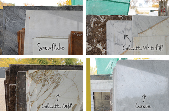
So we regrouped and the next week, went to a marble yard in Dallas. Above are some of the marbles we looked at. The only one that fit the bill was the calacatta white hill… the only problem with that is that we haven’t been able to find a slab of it big enough for the island (102″ long). Also, it’s about a $600 upgrade for just the island over the carrara assuming we only have to buy 1 slab which also seems impossible.

S0 that’s where we are at right now. Carrara throughout the house and still lookin for a slab we like for the island. If you have any grand ideas, let us know. Anyone know of someone who would give us a slab or something?

I guess we should note this is real time here. We literally don’t have anything planned for the island yet. There’s still time for you to help us out!

Tagged As , , , ,

Icemageddon 2013 and some Newborn Talk

We are on day 3 of being iced in with the entire family – mom, dad, little brother and the 4 of us Wills. I’m not getting cabin fever yet. I’m more excited that it’s given me time to catch up on my blog reading aka my most favorite hobby.

I’ve also got some cleaning done(ish). I found Beckett’s hospital photos. I shared his newborns that we had taken when he was 12 days old, but these are ones taken at the hospital by Mom365.

These were taken on the hospital bed while we were all still wearing our bands and alarms. They do not let you take those things off until you are walking out. It’s serious business.

Look at how tiny Beckett’s head is in Nick’s hands. Plus those new squinty eyes that are taking in everything.

We put him in the outfit we took him home in. It was plan B since originally I packed a 0-3 month outfit from the Gap that was huge on him. Nick had to run out to Target and get this number in Newborn. It was still huge despite the fact Beckett was 8 lbs 2 oz – look at how much we rolled up his pants!

I was looking over these wondering how many people still get these photos in the hospital. They aren’t terribly expensive, but they aren’t super cheap either. We paid $130 for the digitals.

I feel like all of us have a picture just like the one above that is typically the first thing you see in your baby book. Even though these pictures aren’t ones we used on our newborn announcements, I felt like I had to get them. It seems like I’d be missing out if I didn’t.

There’s something about the red, splotchiness of a newborn that is so precious. You blink and that time is over. Literally it’s gone in days.

We didn’t take many pictures while we were at the hospital instead we used every second we were there to bond with Beckett. We knew once we headed home our time would be spent learning how to become a family of 4. I’m glad that although hospital photos are slightly hokey we got them anyway.

What do you think are hospital photos a thing of the past? Or are they just a classic tradition? Musing from icemageddon 2013.

There are no tags for this post

Design Decisions: Kitchen Cabinets Color + Stain

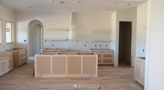
Once the cabinets were installed, it was time to decide how we wanted to finish them. We knew we wanted the cabinets painted from our initial meeting with the carpenter. Painted cabinets are less expensive than stained but not much. It was a style choice rather than a budget one just like the trim.

The painting workflow was to stain everything in the house first. Paint the cabinets and doors then cover them in plastic. Then paint the walls and trim before moving outside.

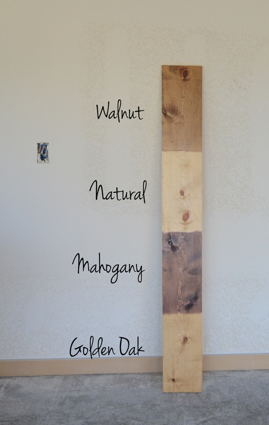
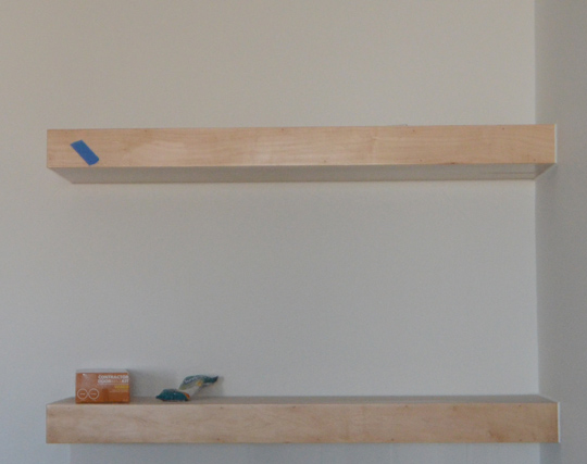
We had to pick a stain for the shelving. Here were some options we were entertaining. The samples are on pine while our shelves are maple, but we got the idea. I was thinking about going very light for the shelves since I figured the floors would be a medium stain.

We went with the natural stain. It’s basically just a sealer since it doesn’t add much other than sheen making the raw wood look more finished. The Golden Oak pulled out the grain of the wood in a very odd way, so I wasn’t a fan. At the time the shelves were surrounded by a bunch of raw wood between the cabinets and the floor. I just had to remind myself that it would look better as things were finished out.

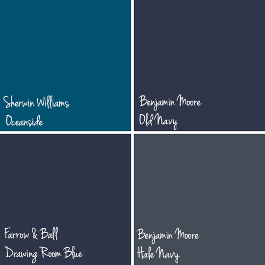
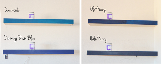
The goal was to paint the cabinets Sherwin Williams Pure White with a pop color on the island – a safe pop color like dark blue. I mean we weren’t going to paint our island pink or anything (although that might have been awesome). We did some research on finding the right shade of dark blue. We came up with these 4. We included a brighter option with the Oceanside and a darker option with the Hale Navy along with 2 basic navies – Drawing Room Blue and Old Navy. We had all of them color matched at Sherwin Williams since that’s what our painter uses.

They painted them on the shelves. (Oh Cody…smh.) It actually worked better for blog purposes, so there’s that. Luckily they hadn’t put the natural stain on just yet, so it was no big deal. Oceanside and Drawing Room Blue were a little too bright. Old Navy was pretty spot on for a classic navy. Hale Navy was very dark. Beautiful but dark.

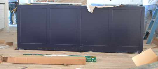
We went with Old Navy. Hale Navy was just too dark especially with the black doors. We love the color. It really was the exact blue we envisioned for that room.

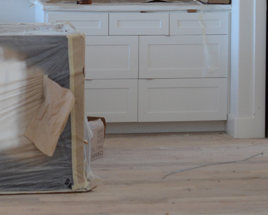
Here’s a little peak at the white cabinet behind the island. The paint made the kitchen feel like it was coming together. It was then that the natural stain on the shelving didn’t seem so bland.

The cabinets and shelves were immediately covered, so I couldn’t get a picture of that stage. The shelves were covered. The island was painted then covered. Then the cabinets were painted and covered. Plus the windows were covered, so our house was dark. You will just have to use your imagination to see the white cabinets, Old Navy island, and natural shelving.

Countertops and tile to come…

There are no tags for this post