Change of Plans

I had planned to have a Fashion Friday post up for y’all today. Unfortunately we’ve been dealing with a very sick dog. Our black lab Sara is really getting into the country life and loves exploring with my parents’ beagle. She started hobbling yesterday. Her leg was swollen, and she had several cuts (including one on her ear which is why it looks so mangey in this pictures).

I immediately took her to the vet. They started an IV and antibiotics and kept her overnight. She will most likely stay there this weekend. We are hoping that surgery won’t be needed but won’t know until probably later today based on how she is responding to treatment.

The vet isn’t sure if she was attacked by something or maybe got caught up in a barbed wire fence. The good news is her blood work is pretty good, and we acted early.

Sorry to start your weekend off on a sad note, but I’ll keep you posted via social media. We are headed out of town this weekend which is awful timing but can’t be rescheduled since baby 2 will be here all too soon.

There are no tags for this post

Post Framing Video Walk Through

Yesterday, Amber wrote a post about the house being framed and today we have a video for you to watch! We wanted to give you guys a better feel for the house and floor plan and what better way to do that than putting our goofy mugs on video!

This is our first video so please cut us a bit of slack. Here are a few of my observations on the process:

  • The volumes are wacky, yes we know. We don’t have an external mic, just whatever came through to the tiny one built into the camera. Picking up Amber’s voice was sketchy at times.
  • Talking while shooting video and checking focus is difficult and I’m not very good at it.
  • No matter how old you get, listening to your own voice is unnervingly painful.

With all that said, we hope you guys enjoy! Let us know what you think!

In case you’re wondering Amber is 34 weeks at this point.

There are no tags for this post

Framing the Beast

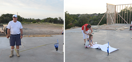
After the foundation was poured, remember how I was freaking out that it was too small? I recruited my mom and dad to come measure it with me just in case. I was shocked to see they had already started framing. I quickly gave up on measuring and just assumed everything was right. (It was hot and pretty much a done deal at that point anyway.)

5 days later our bottom rooms were pretty much framed out. I still was a little leery about the room sizes, but they definitely didn’t feel as tiny now (also my stomach is huge).
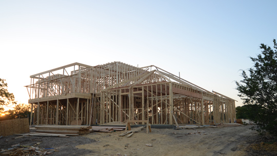
The top story was framed in about 2 days. There were still some framing details going on over the next couple of days, but I felt like it went up so quick. While the framers were still onsite, I made a list of things that needed to be changed or that I had questions about, so I could go to my builder immediately.
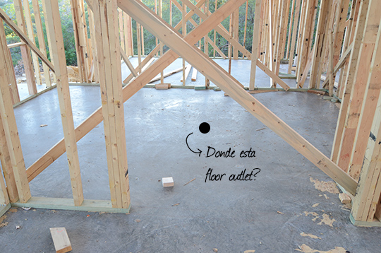
In the office, I noticed our floor outlet was missing. This was a big bummer to Nick who has plans to center his desk in the room. Luckily we can still have an outlet there without cutting into the cement and running new electrical since we are putting wood floors in there. The outlet can just be run under the flooring. (Collective sigh of relief.)
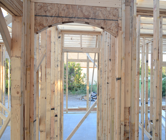
Our hallways had an eyebrow arch instead of a fully rounded arch. There’s nothing wrong with eyebrow arches, but we wanted a full arch. Not a difficult change, but so glad we caught it.
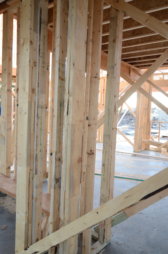
Admittedly this is difficult to see, but this was dead space where the AC return vent was supposed to go. I asked if we could put that somewhere else and use this space. We could! I had them take one side off to make it into a bookshelf off the kitchen (across from the pantry). This also means I don’t have to put a bookshelf in the island. Yea for more drawer space!
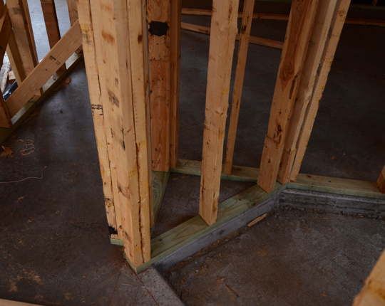
There was more dead space between the walk in shower and master closet. I asked that it be removed, so I could mount a full length mirror or something in there. It did cut down a little on the shelving ,and we had to move the switches (oops). However I think I will like the slight layout change better in the end.

The windows in the master were supposed to be a little longer. This was a change we made in our window meeting. It wasn’t conveyed to the framers. No biggie deal though. It’s a simple fix that would have been discovered when the windows came in anyway.
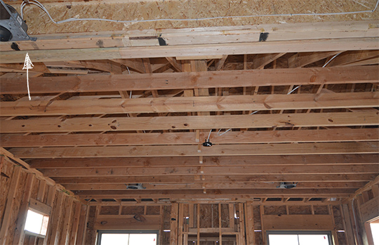
The biggest punch in the gut came with the master ceiling. I swear I took a million pictures of this that are no where to be found, so sorry you’ll have to imagine a little with me since it’s “fixed” in this picture. Originally the plans showed the ceiling as trayed even though we asked for vaulted ceilings twice during the design phase. Somehow they never got changed.

Well the problem with the trayed ceiling is they started about 4 feet into the room (see arrow). We debated on whether we should just keep the irregular tray ceiling and just enjoy the height it brought to the room. Once we looked at how the electrical was going to have to be done, we immediately decided it was best to just frame the master for 10 foot ceilings. It was a sad day, but there was absolutely nothing that could be done about it. (Tip: Reading house plans is so difficult. Have your builder/architect explain every freaking line to you because it ALL means something!)
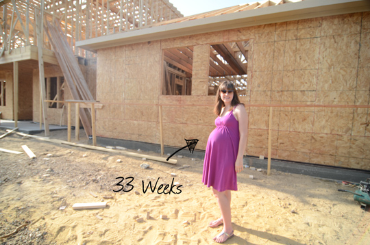
The plywood started going on once all the inside was framed out.
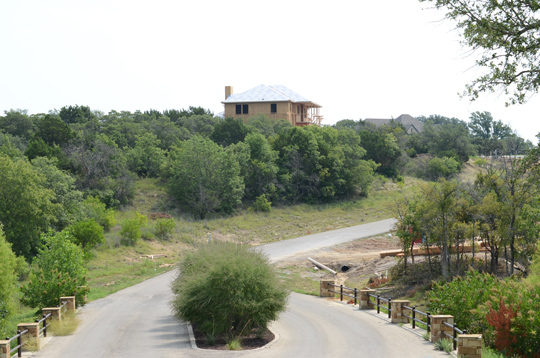
About a week later our house on the hill looked like this once you rounded the corner of the subdivision. The framing took a little less than 3 weeks to complete.  We have a full VIDEO (!!!!!) walk through for you tomorrow.

There are no tags for this post

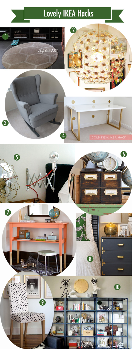
We have been all about IKEA so far this week. I wanted to showcase some beautiful IKEA hacks by some pretty crafty bloggers since it would be weird to show you a space with IKEA in my house that is currently just framed out (more on that tomorrow).

1. Hex Rug // 2. Sputnik Chandelier // 3. Wingback Rocker
4. Gold Desk // 5.  Bedside Lamp // 6. Card Catalog //7. Dipped Leg Console
8. Nightstand // 9. Dalmatian Chair // 10. Painted Bookcase

I love the geometric rug. It’s right on trend and such an easy DIY at an affordable IKEA price.

Gold/brass are so huge right now which explains my love for about half the items on this round up. Of course lighting is top of mind with me since we’re building. You can’t beat the price for the product with both lighting hacks (even when we are talking builder discount pricing people).

It’s just amazing what a little vision, paint, and time will do with some IKEA products. I have always been drawn to the clean lines and modern look of IKEA. It’s always great to see people use those good bones and customize it for something totally unique.

Check out how these lovely ladies have used IKEA in their home. It’s seriously good. I promise to step up my IKEA game once I have a house again!

Anu at Nalle’s House

Ainhoa at A Little Bite of Everything

Katja at Shift Ctrl Art

Kim at Newly Woodwards

Gretchen at Boxy Colonial

Posted by Amber in DIY, Inspiration on | 21 Comments

IKEA Dream Home + Blogger Style Tour

Remember that time when those 6 bloggers decorated an entire (imaginary) house using only IKEA? Me too. It was awesome. Hope you went on the tour yesterday. I wanted to share the rest of the inspiration today just in case you missed it. Make sure to click on the links to view the sources!

Anu’s living room is so relaxing with the neutrals and gold. It has just the right mix of pattern and texture. I really love that wallpaper with the giant deer head too. It speaks to my Texas heart.

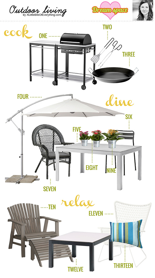
Ainhoa’s Outdoor Space is a genius set up with the 3 separate areas. I love the mixed chairs. It keeps the space looking eclectic instead of composed entirely of products from one store.

Katja’s Master Bedroom is such an inviting space. I love how calming it feels  with pattern and color. The warm woods and whites make me want to snuggle up in here at night. Plus how on trend is she with the black and white accents!

Kim’s Kitchen is gorgeous. I love the gray cabinets with a farm house sink and glass front on the upper cabinets. The yellow rug works perfectly with the gray.

Gretchen’s Bathroom is such a great mix of purple and green. I’m not even a huge purple fan, but I love how it works in this space. Imagine it with a claw foot tub and some penny tile.

Great job ladies! In case you missed it, I was in charge of designing a kid’s room. This has been incredible fun and inspiring! I’m glad I had such a wonderful group of ladies to work with! Make sure to go check out their sources and pin for all your future IKEA trip needs!

Tagged As , , , ,

IKEA Dream Home + Blogger Style: Kid’s Room

Today is an exciting day people. I have teamed up with 5 amazing bloggers to decorate an entire home using only IKEA products. It’s the brain child of Katja who is basically an IKEA sensei.

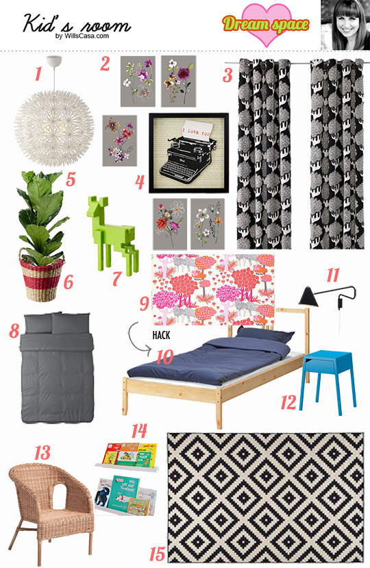
Each of us was randomly assigned a room (done via cute video and all). Then we created a mood board exclusively with IKEA products. I got kid’s room which is a great follow up to nursery week. So once that baby is done being well a baby, here’s some big kid room inspiration (assuming the kid is a girl).

1. MASKROS Pendant Lamp // 2. KORT Art Cards // 3. KAJSAMIA Curtains
4. OLUNDA Picture //5. FICUS LYRATA //6. SALMBAR Plant Pot
7. SAMSPELT Deer //8. GASPA Duvet // 9. ALGORT Fabric
10. FJELLSE bed // 11. LED Lamp //12. SELJE Nightstand
13. AGEN Child’s Chair // 14. RIBBA Picture Ledges (photo via)
15. LAPPJUNG RUTA Rug

There was a lot of pattern going on in this room, so I wanted to keep the main pieces (rug, curtains, duvet) black and white. I feel like kid’s rooms can get crazy in a hurry with all their toys and general kid stuff. It’s best to keep pattern and color down to a minimum. Another bonus to the black and white base is that you can change your mind about the pop colors on a whim. You aren’t suck.

I threw in a little DIY too. I love the fabric at IKEA, so I knew I had to work it in somewhere. I found that beautiful pink, orange, and gray fabric to upholster the bed in following this tutorial. Aren’t feeling that ambitious? Buy the fabric and make pillows or a duvet with it. That fabric makes the room.

On our last IKEA trip, I saw the wicker chairs in child size. It took a lot for me to hold off buying them. They are adorable. I like the texture it brings to the room, but they would be great for outdoors too. We had the picture ledges as a bookcase in Ramona’s nursery. It was one of my favorite things. If you can do floor to ceiling with it, then go for it!

Make sure you check out the other rooms on the IKEA home tour:

Living Room by Anu at Nalle’s House

Outdoor Living by Ainhoa at A Little Bite of Everything

Master Bedroom by Katja at Shift Ctrl Art

Kitchen by Kim at Newly Woodwards

Bathroom by Gretchen at Boxy Colonial

**None of us were perked or encouraged by IKEA to post this. It’s just something Katja wanted to do, and we all thought it was too awesome to pass up! Hope you enjoyed it!

Tagged As ,

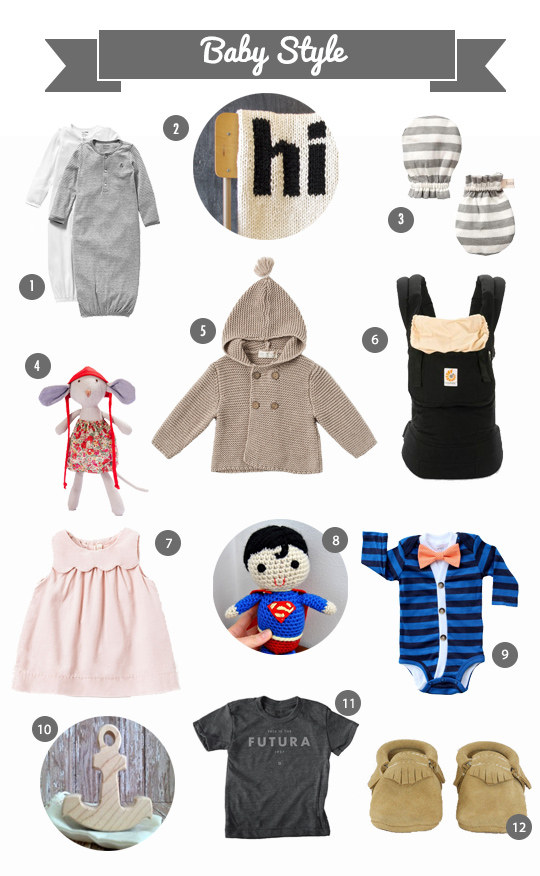
Fashion Friday: Baby Style

Since we’ve been all about nurseries this week, it seems fitting to make Fashion Friday about babies. I will say that registering for gender neutral stuff is so difficult. The good thing is neutrals are very stylish right now, so you can’t go wrong.

1. Gowns // 2. Hi blanket // 3. Mittens
4. Catalina Mouse // 5. Jacket // 6. Ergo Carrier
7. Scallop Dress //  8. Superman // 9. Cardigan Onesie
10. Anchor Teether // 11. Futura Shirt // 12. Freshly Picked Moccasins

Traditionally I think gender neutral has meant yellow and greens. Now it’s blacks, grays, tans, and (dare I say) navies. For a girl you can throw a bow on with any of those and have a girly look. For a boy you don’t have to worry because if your baby doesn’t have a bow people will assume it’s a boy anyway. Win win here people.

The gowns from Gap were one of our favorite things with Ramona. They make late night diaper changes a breeze. I threw in a girl dress and toy along with a boy outfit and toy because let’s face it most people find out the gender. Both of them are adorable. The tan jacket would look great over a floral dress or jeans – so perfect for gender neutral.

I had to include the Future shirt thanks to Nick’s girl nursery. Admittedly it could go to either gender though it skews more boy, so just put a skirt and bow with that thing! (Are you seeing a pattern?) Love the wooden teether (this Texas option too.) Every baby of a blogger needs a pair of Freshly Picked Moccasins, right?

Technically the Ergo isn’t baby style as much as mommy style, but it’s essential nonetheless. Trendy gender neutral options with some girl and boy options for those of you who aren’t crazy and find out!


There are no tags for this post

Nursery Week: Amber’s Girl Nursery

It’s the final day of nursery week. We’ve had a lot of late night conversations around our mood boards and tweaks we would make in real life. It’s been a lot of fun sharing our vision with each other and you guys.

1. Landscape Print
2. Gold Horse Shoe
3. Watch with Glittering Eyes
4. No. 2 Metal Sign
5. Abstract Canvas
6. Vintage Mobile*
7. Owl
8. Babyletto Hudson Crib
9. Triangle Pillow
10. Strawberry Crib Sheet
11. Monte Luca Glider*
12. Vintage Swiss Army Blanket*
13. Polka Dot Pouf
14. Side Table
15. Giraffe Lamp
16. Vintage Fan
17. Overdye Rug
18. MCM Dresser Changing Table*

asterisk (*) on objects we already own

I stuck with a color palette of red, teal, and gold/yellow. I threw in a horse shoe to be oh so Texas. After I finished I was shocked that I had no pink in my girl nursery unless you count the tiny bit that’s in the abstract art. Don’t ask me how that happened, but I still feel like this nursery is very girly.

The No. 2 metal sign is a slight joke since this is baby #2 who is in fact nameless thanks to 1) not knowing the gender thus being a little ADD with narrowing things down and 2) us not allocating time to really think/talk about a boy and a girl name for this kid. Don’t worry baby 2 we designed 4 nurseries for you, so clearly your lack of a name at this point is made up by this outpouring of interior design love.

What do you think? Any favorites? Anyone want to make some bets about gender or delivery days? (My official due date is September 27th just FYI.)

Make sure to check out my boy nursery, Nick’s boy nursery and girl nursery if you haven’t already!

Tagged As

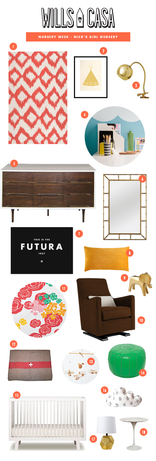
Nursery Week: Nick’s Girl Nursery

Have you been following along with Nursery week so far? For you new readers out there, here’s the deal: Amber is pregnant, but we’re not finding out the sex (also our new house won’t be finished in time, so having a nursery prepared isn’t an option). So this week we thought it’d be fun to each design 2 nurseries, one for a boy and one for a girl.

Amber started off with a boy nursery on Monday and I went yesterday with my boy nursery. Today I’m going first with my girl nursery. As I mentioned in my last post,  I struggle with girlie objects, colors, etc. They’re not something I like personally (for obvious reasons), so it was a struggle.

girl nursery eclectic vintage modern swiss army dwell studio scallop pattern

1. Ikat Rug
2. I Love My Family Print
3. Gold Lamp
4. Scalloped Walls
5. MCM Dresser Changing Table*
6. Gold Mirror
7. Futura Print
8. Velvet Pillow
9. Gold Elephant
10. Monte Luca Glider*
11. Floral Sheets
12. Vintage Swiss Army Blanket*
13. Vintage Mobile*
14. Leather Pouf
15. Ouef Sparrow Crib
16. Cloud Pillow
17. Geometric Lamp
18. Tulip Side Table

asterisk (*) on objects we already own

Obviously I like for rooms to have an eclectic feel. A bunch of different styles and a lot going on. The base for this room would be the scalloped walls and the dwell studio rug. On top of that I layered most of the same existing things that we already owned and a bunch of other craziness. Maybe that will become our signature design style “A bunch of crap we own mixed with other craziness.”

Come back tomorrow to see what Amber comes up with. Are you as excited as I am?

Tagged As , , , ,

Nursery Week: Nick’s Boy Nursery

Monday, when I saw Amber’s mood board for the boy nursery, I kind of freaked out a bit. First, I thought it was awesome. Secondly, I realized it had pretty much put mine to shame. I wasn’t completely finished with mine, so I had some time to make some tweaks (actually a lot… yea, that’s pretty much me admitting to cheating).

So after reshuffling the deck a bit, here’s what I came up with.

boy nursery mood board west elm monte glider vintage mobile diy dresser

1. Babyletto Hudson Crib
2. Wythe Toile Wallpaper
3. Vintage Swiss Army Blanket*
4. Industrial Lamp
5. Cushion*
6. Map of Austin
7. Chevron Crib Sheet
8. Print
9. Vintage Striped Arrows
10. Rabbit Night Light
11. Vintage Toy Cars
12. MCM Dresser*
13. Blue Star Flag
14. Pennant
15. Monte Luca Glider*
16. Side Table
17. Vintage Airplane Mobile*
18. Istanbull Rug
19. Aeropress

asterisk (*) on objects we already own

I tried to take some of the objects that we already have and add in a mix of new and vintage. Some modern style along with some classic. Not a ton of color, but enough to keep the room from feeling dead.

So what do you think? Are you surprised that mine and Amber’s were as similar as they are? I was a bit, to be honest with you. I knew Amber’s would be better. I was just trying to not embarass myself. I think in the girl round ours will be more different than there were as I have a hard time with girly furnishings.

Amber Edit: Of course I saw Nick’s and dropped an obscenity because it’s that good. He’s much better at putting a room together than I am. The guy is so good, and don’t believe the part about the girly furnishings. He’s sandbagging I know it.

Some affiliate links included.
Tagged As , , , , ,