Amber and I are doing our own separate Pinterest Challenge posts, so mine will post today and her’s will post tomorrow. They work together but are different projects (read too long for one post).
(source)
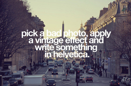
Above is my inspiration image. Yes, I understand that it is making fun of the genre, but when I saw it I had an idea. Basically I wanted to find a cheap vintage piece of art, so I could put a type treatment on top of it. Finding a vintage landscape-ish piece was on the top of my list when we went to the Nashville Flea last month.
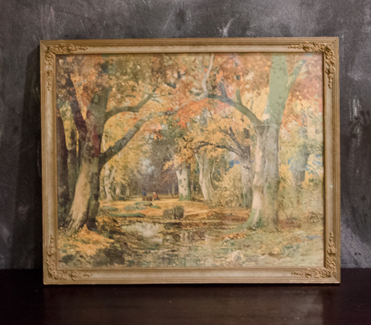
This is the piece we found. Amber wasn’t sold on it, but she knew I had a plan which never happens when we antique shop. (Side Note: Amber wasn’t the only person not feeling it. When we were showing our scores at the flea to some of Amber’s family members in TN, the only nice thing they had to say about this one was “Well, it’s got a nice frame.”)
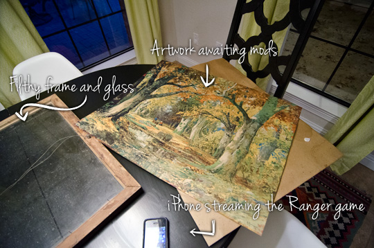
The first thing I did was remove the artwork from the frame.
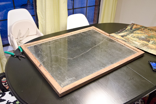
Boy howdy, was that bad boy filthy. A little windex and some elbow grease and the glass looked good as new.
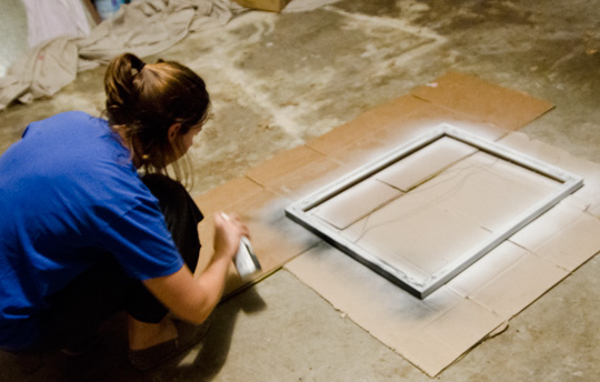
With the glass and artwork separated, Amber took the frame to the garage to update it with a bit of flat black spray paint after she primed it of course.
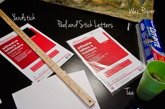
Here are the supplies I started off with to layout the type:
- 2 in. white helvetica letters from office depot. I bought 2 packets for about $5 each.
- Wax paper
- Yard Stick
- Iced Tea (optional)
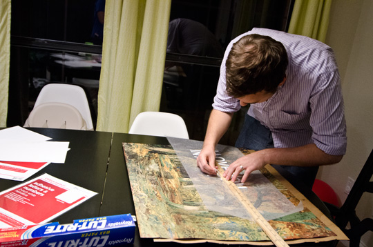
Originally, I thought I would use the yard stick and lay them out by hand. This proved to be really difficult and looked bad. Unhappy with the results I regrouped a bit.

After a text message conversation with Mrs Weydeck (Her husband and Amber were in the group text as well, no funny business happening at Wills Casa), an expert seemingly at all things craft, I decided to lay the type out in Photoshop, print it out, and use it as my guide.

Using the printed text under the wax paper proved to be much easier, exact and faster. A real win-win-win situation we had working there. You probably can’t tell from the photo, but I misspelled the word is (added an extra ‘s’) in the first run…. yea, hurts to miss that one.

After the type was done, we put painters tape across the top to pull the letters off the wax paper. I used Frog Tape because it’s what we had laying around, though I would recommend using a tape made for delicate surfaces if you can.
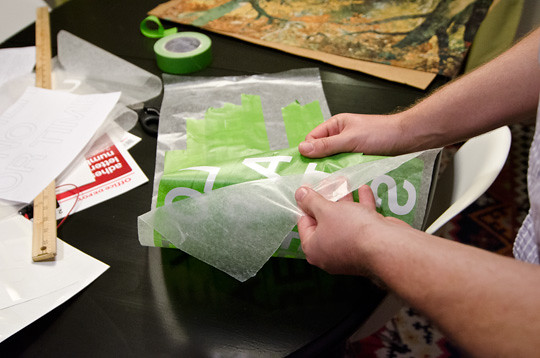
Next I peeled the letters off the wax paper. Lots of gratuitous peeling action happening in this photo.

Here’s what the type looks like peeled off and ready to stick on the artwork.
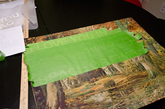
Then we placed the type on the artwork and peeled the frog tape. Here’s the part where more delicate painter’s tape would have helped. Some of the print peeled up with the tape (you can’t really tell in fact it gives a little charming noise).
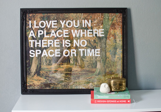
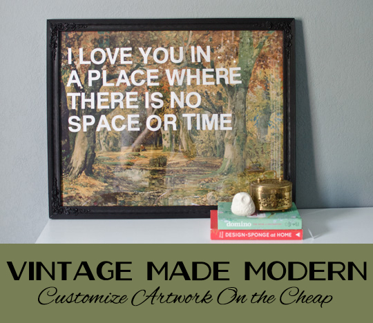
After letting the frame dry over night, we reframed the artwork and BOOM! The piece was done.
The total project cost us about $25, not too bad eh?
If you’re wondering where the quote is from, it’s a line from an old Leon Russell song seen in the video above. I actually got the idea from a vintage rolex that I saw on eBay (but appears to have sold). The quote is the main reason why I wanted it to be a landscape. I thought the quote needed to be on top of a Place.
So what do you guys think of the artwork? Any of you guys doing the Pinterest Challenge as well? We’d love to hear from you!
See this guy in our gallery wall here.
Check out what Sherry, Kate, Katie, and Michelle did for their pinterest challenge!


ElseWhere FaceBook | Twitter | Instagram | Pinterest